In this artist tip, I'll take you through my process of painting a New England seascape. I enjoy painting seascapes, and have visited the Maine coast often to gather reference material for my paintings. This painting is of a lobster boat I saw in the harbor in Rockland, Maine, a few years ago.
I begin all of my watercolor paintings with a simple pencil sketch on dry watercolor paper. For this painting I used Arches 140# cold-press paper cut to 7.5x11". I use a #2 mechanical lead pencil and a white plastic eraser. I try to draw enough details to provide an accurate guide for my painting, but not so much that I cannot make changes as I paint:
Before I begin painting, I wet the paper on both sides, and then dry the top surface with a towel. The dry surface holds painted edges, while the water within the paper makes it easier to achieve smooth washes with no blooms.
I rewet the sky to keep it soft, and then painted it with a light wash of blue and purple, leaving some white areas to represent wispy clouds. I extended this wash down through the horizon. Next, I painted the distant hills while the sky was still damp to give the hills a soft edge and a feeling of distance:
I then painted the water, leaving some white areas to represent foam. I painted around the boat. I don't like to use masking fluid because it can leave hard edges, and can make a painting look "tight" or "rigid".
Next I painted the large areas and major shapes of the boat. Figures always make a landscape of a seascape painting more interesting. Shadows are also important. It's good to have both white and darks in your center of interest to draw the eye to it:
To complete the painting, I added more details like the masts and rigging, the sea birds, and the distant sailboats. I used white gouache for some of these shapes, which works fine for thin lines and very small areas. I also added some dry brush strokes in the foreground water to give it more interest and bring it forward:
This is my usual approach to landscapes and seascapes: first, paint earth and sky; second; paint the major shapes of the subject; finally, add details for interest.
As of this posting, the painting Lobstah is still available for purchase for $100 including shipping in the US. Just click here for more details.
I hope you found this step-by-step explanation useful. I've also turned this step-by-step demo into a YouTube slide show for your enjoyment and education. Just click here to watch the video.
I hope you found this artist tip useful. If you'd like to get artist and art collector tips like this delivered directly to your inbox every few weeks, sign up for my fine art e-newsletter here! When you subscribe, you'll receive a 10% instant rebate valid for one month for any of my paintings.
Showing posts with label artist tips. Show all posts
Saturday, April 25, 2015
Artist Tip #33 - Painting "Lobstah" Step-by-Step
Labels:
artist tips
Sunday, February 22, 2015
Artist Tip #32 - Perspective Made Simple
In this artist tip we'll cover the basics - and I mean the very basics - of perspective. Perspective is not really part of "design" per se, but correct perspective is very important to a realistic painting's "believability". If you paint exactly what is before you, you need not know anything about perspective - all the visual information you need is right there. But if you move shapes, add figures, change lighting, etc., you need to know how shadows, reflections, and perspective work. We've already covered cast shadows in Artist Tips #4, #5, and #6, and reflections in Artist Tip #7.
Before we dive into perspective, it's very important to understand the horizon line, covered in Artist Tip #30. I suggest you review that post before proceeding here.
Perspective is the art of representing a 3-dimensional scene on a 2-dimensional surface so as to give the correct impression of the objects' relative sizes and positions when viewed from a particular point. There are 3 major conventions of perspective - designated as 0-point, 1-point and 2-point perspective - and these refer to the behavior on the painting surface of lines which are parallel in reality. For simplicity, we'll consider only lines that are parallel to each other and to the horizontal surface. All horizontal lines terminate in a vanishing point on the horizon line. As defined in Artist Tip #30, the horizon line is the distant horizontal line at your eye level as you're looking at the scene.
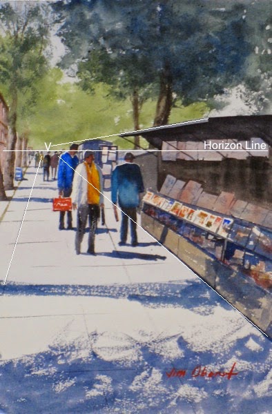
In 1-point perspective, parallel horizontal lines in the picture plane all converge on a single point on the horizon line called the vanishing point, usually within the painting frame. This happens when we look at a scene where we can only see one side of the included buildings, roads, etc. Here is an example - Seine-Side Booksellers - where the buildings on the right and the tree line on the left "hem us in" between them:
Here the single vanishing point is approximately at point "V", and is on the horizon line. Note that often a painting looks more "relaxed" and less mechanical if a small vanishing "area" is chosen rather than a strict point.
Also note where the heads of the adults are - all are on or near the horizon line, regardless of how close or far they are from the viewer, because they and the viewer are all standing on the same level sidewalk. The position of the feet determines how close the figures look; the position of their heads indicates how tall they are. This is very important information to be aware of if you are adding figures or moving them around in your scenes. If the sidewalk cracks and the book stands were not parallel to each other, they would not point to the same vanishing point.
Here is one other example of a single vanishing point. But in Spruce Head Wharf we can only see buildings on the left side, and the single vanishing point is beyond the edge of the painting:
Here, note that the viewpoint is above the two figures, so their heads are lower than the horizon line. If the viewer were lower - say, on a boat in the water near the bottom of the painting, the heads would be above the horizon line.
In 2-point perspective, we see both sides of, for example, a building, and the horizontal parallel lines from the different sides have a different vanishing point. In the painting Gambrel Roof Barn, we see both sides of the barn, so there are two different vanishing points:
Both happen to be beyond the edges of the painting. If the viewpoint were closer to the barn, we would see more acute angles, and the vanishing points would move in toward the painting.
Now, if the viewer stands directly in front of a shape, like a building, and far enough away so that one side is perpendicular to him/her, and the other sides cannot be seen, perspective degenerates into entirely parallel lines, or 0-point perspective. In this case, the parallel lines in reality remain parallel in the painting, as in the painting Cheyenne Station:
This is by far the simplest type of perspective - no perspective at all! Lines that are parallel and horizontal in the "real world" stay that way in the painting.
I hope you've found this brief discussion of the basics of perspective useful. To cover perspective in depth would take an entire book, but what I've covered here will stand most realistic painters in good stead.
I hope you found this artist tip useful. If you'd like to get artist and art collector tips like this delivered directly to your inbox every few weeks, sign up for my fine art e-newsletter here! When you subscribe, you'll receive a 10% instant rebate valid for one month for any of my paintings.
Before we dive into perspective, it's very important to understand the horizon line, covered in Artist Tip #30. I suggest you review that post before proceeding here.
Perspective is the art of representing a 3-dimensional scene on a 2-dimensional surface so as to give the correct impression of the objects' relative sizes and positions when viewed from a particular point. There are 3 major conventions of perspective - designated as 0-point, 1-point and 2-point perspective - and these refer to the behavior on the painting surface of lines which are parallel in reality. For simplicity, we'll consider only lines that are parallel to each other and to the horizontal surface. All horizontal lines terminate in a vanishing point on the horizon line. As defined in Artist Tip #30, the horizon line is the distant horizontal line at your eye level as you're looking at the scene.
In 1-point perspective, parallel horizontal lines in the picture plane all converge on a single point on the horizon line called the vanishing point, usually within the painting frame. This happens when we look at a scene where we can only see one side of the included buildings, roads, etc. Here is an example - Seine-Side Booksellers - where the buildings on the right and the tree line on the left "hem us in" between them:
Here the single vanishing point is approximately at point "V", and is on the horizon line. Note that often a painting looks more "relaxed" and less mechanical if a small vanishing "area" is chosen rather than a strict point.Also note where the heads of the adults are - all are on or near the horizon line, regardless of how close or far they are from the viewer, because they and the viewer are all standing on the same level sidewalk. The position of the feet determines how close the figures look; the position of their heads indicates how tall they are. This is very important information to be aware of if you are adding figures or moving them around in your scenes. If the sidewalk cracks and the book stands were not parallel to each other, they would not point to the same vanishing point.
Here is one other example of a single vanishing point. But in Spruce Head Wharf we can only see buildings on the left side, and the single vanishing point is beyond the edge of the painting:
Here, note that the viewpoint is above the two figures, so their heads are lower than the horizon line. If the viewer were lower - say, on a boat in the water near the bottom of the painting, the heads would be above the horizon line.
In 2-point perspective, we see both sides of, for example, a building, and the horizontal parallel lines from the different sides have a different vanishing point. In the painting Gambrel Roof Barn, we see both sides of the barn, so there are two different vanishing points:
Both happen to be beyond the edges of the painting. If the viewpoint were closer to the barn, we would see more acute angles, and the vanishing points would move in toward the painting.
Now, if the viewer stands directly in front of a shape, like a building, and far enough away so that one side is perpendicular to him/her, and the other sides cannot be seen, perspective degenerates into entirely parallel lines, or 0-point perspective. In this case, the parallel lines in reality remain parallel in the painting, as in the painting Cheyenne Station:
This is by far the simplest type of perspective - no perspective at all! Lines that are parallel and horizontal in the "real world" stay that way in the painting.
I hope you've found this brief discussion of the basics of perspective useful. To cover perspective in depth would take an entire book, but what I've covered here will stand most realistic painters in good stead.
I hope you found this artist tip useful. If you'd like to get artist and art collector tips like this delivered directly to your inbox every few weeks, sign up for my fine art e-newsletter here! When you subscribe, you'll receive a 10% instant rebate valid for one month for any of my paintings.
Labels:
artist tips
Saturday, December 13, 2014
Artist Tip #31 - Treatment at the Edge
I've mentioned before that we realistic painters are in the illusion business - we're magicians. We "represent" a limitless, 3-dimensional, moving reality in a 2-dimensional, limited-size, stationary painting. Unlike nature, the surface to which we apply paint, called a "ground" - paper, canvas, wood, etc. - has a limit, or "frame". Once we make a positive shape within its rectangle, we have automatically created negative shapes around that positive shape, and these are also very important.
One of our goals as artists is to entertain the viewer, and keep his/her eyes on our painting as long as possible. How we handle the edges of our painting can affect this. In particular, it's helpful to avoid running long oblique lines off the lower edge of the painting, and to avoid having a white or bright area at the edge of the painting. These little tricks help to keep the viewer's eyes inside our painting, rather than running off its edge.
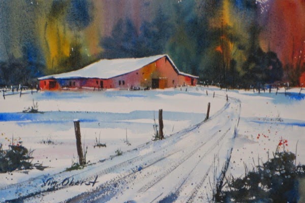
Here is an example where I tried to avoid these two things. The long upper edge of the dirt road was run off the side, rather than the bottom or corner, of the painting. And the shadow in the foreground over the light-valued road acts as a "block" to keep the eye from wandering off the bottom of the painting:
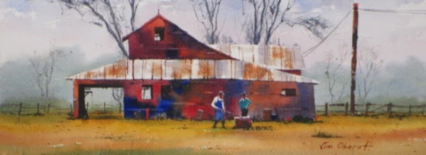
Another design issue to be wary of is to avoid having the edge of a shape near and parallel to the edge of the painting, with a small empty space between the shape and the edge. This tends to draw attention to the edge, which is not where we want our viewer's eyes to be focused. One should either separate the object from the edge and "lean" it so it is not parallel to the edge, or overlap it with the edge of the painting. This painting shows the latter approach, where the vertical tree at the edge of the painting has been overlapped with the edge, thus becoming a visual "stop" to keep the viewer's eyes within the painting:
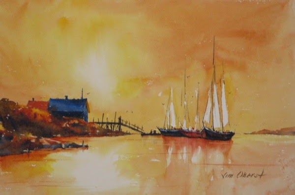
Finally, in general it is good to run shapes off the edge of the painting, to make the edge seem less "real". Often in beginner's paintings we see trees "stunted" to force their entire crown to fit inside the painting frame, and the artificial look this creates. The first painting above shows how running trees off the top of the painting looks more natural; it appears that we are looking at the scene through a window. This same idea applies to anything tall, including sails and ship masts, as in the images below:
I hope you found this artist tip useful. If you'd like to get artist and art collector tips like this delivered directly to your inbox every few weeks, sign up for my fine art e-newsletter here! When you subscribe, you'll receive a 10% instant rebate valid for one month for any of my paintings.
One of our goals as artists is to entertain the viewer, and keep his/her eyes on our painting as long as possible. How we handle the edges of our painting can affect this. In particular, it's helpful to avoid running long oblique lines off the lower edge of the painting, and to avoid having a white or bright area at the edge of the painting. These little tricks help to keep the viewer's eyes inside our painting, rather than running off its edge.
Here is an example where I tried to avoid these two things. The long upper edge of the dirt road was run off the side, rather than the bottom or corner, of the painting. And the shadow in the foreground over the light-valued road acts as a "block" to keep the eye from wandering off the bottom of the painting:
Another design issue to be wary of is to avoid having the edge of a shape near and parallel to the edge of the painting, with a small empty space between the shape and the edge. This tends to draw attention to the edge, which is not where we want our viewer's eyes to be focused. One should either separate the object from the edge and "lean" it so it is not parallel to the edge, or overlap it with the edge of the painting. This painting shows the latter approach, where the vertical tree at the edge of the painting has been overlapped with the edge, thus becoming a visual "stop" to keep the viewer's eyes within the painting:
Finally, in general it is good to run shapes off the edge of the painting, to make the edge seem less "real". Often in beginner's paintings we see trees "stunted" to force their entire crown to fit inside the painting frame, and the artificial look this creates. The first painting above shows how running trees off the top of the painting looks more natural; it appears that we are looking at the scene through a window. This same idea applies to anything tall, including sails and ship masts, as in the images below:
I hope you found this artist tip useful. If you'd like to get artist and art collector tips like this delivered directly to your inbox every few weeks, sign up for my fine art e-newsletter here! When you subscribe, you'll receive a 10% instant rebate valid for one month for any of my paintings.
Labels:
artist tips
Sunday, October 19, 2014
Artist Tip #30 - The Horizon
It's very important for landscape painters to be able to identify the horizon line, and to know how to handle it in their paintings. According to the dictionary, the horizon is the line at which the earth's surface and the sky appear to meet. This "line" may or may not be visible in the landscape you're observing. If you're looking at the sea, where there's nothing "in the way" of the horizon, it can actually be seen. But there may be features between your eye and the horizon that block your view of it... mountains, trees, or buildings, for example. In these cases, it's important to be able to judge where that horizon line really is.
In a future artist tip, we'll cover perspective, and you'll learn that all horizontal lines converge in the distance to the horizon line. But for now, the best way to think of it is as the distant horizontal line at your eye level, when you're looking at the scene. It may be blocked by closer objects, but it's there none the less. Here are a few examples of the horizon line. First, a seascape, where the horizon line is very obvious:
Here is a landscape with a very low horizon line, whose position is much less obvious:
How does one estimate the horizon line in this painting? Note that it's very clear that you're looking up at the lighthouse - you can see the inside of the turret, and the bottom of the rain gutters. Also, the sea, which is to the left, cannot be seen even at the lower left of the painting. So one can deduce that the horizon line is approximately where I've marked it, or even a bit lower.
Here's a painting with a very high horizon line:
Note that when you're looking down at a scene, the horizon line is high.
Choosing the position of the horizon line is part of planning your painting. You can compose your painting so the horizon line is somewhere near its midpoint, but often more interesting compositions are created by placing the horizon line very high or very low, so that you have an unusual viewing perspective of your subject.
Your center of interest will often be found near the horizon line. Our comments in Artist Tip #20 about placing the center of interest in an interesting position also hold true about the horizon line. It's not recommended to put the horizon in the center of the composition - it will split your painting into two equal parts, which is a very boring arrangement. Put it higher or lower - a 2:1 ratio of area above and below the horizon line leads to a much more interesting composition. And be extra careful when you use a low horizon line - it's very easy to wind up with a dark horizontal hill or tree line either at the center of the paper, or breaking the picture area up into three equal areas - rather boring. A high horizon line is much "safer".
If you'd like to get Artist and Art Collector Tips like this delivered directly to your inbox, sign up for my fine art e-newsletter here! When you subscribe, you'll receive a 10% instant rebate valid for one month for any of my paintings.
In a future artist tip, we'll cover perspective, and you'll learn that all horizontal lines converge in the distance to the horizon line. But for now, the best way to think of it is as the distant horizontal line at your eye level, when you're looking at the scene. It may be blocked by closer objects, but it's there none the less. Here are a few examples of the horizon line. First, a seascape, where the horizon line is very obvious:
Here is a landscape with a very low horizon line, whose position is much less obvious:
How does one estimate the horizon line in this painting? Note that it's very clear that you're looking up at the lighthouse - you can see the inside of the turret, and the bottom of the rain gutters. Also, the sea, which is to the left, cannot be seen even at the lower left of the painting. So one can deduce that the horizon line is approximately where I've marked it, or even a bit lower.
Here's a painting with a very high horizon line:
Note that when you're looking down at a scene, the horizon line is high.
Choosing the position of the horizon line is part of planning your painting. You can compose your painting so the horizon line is somewhere near its midpoint, but often more interesting compositions are created by placing the horizon line very high or very low, so that you have an unusual viewing perspective of your subject.
Your center of interest will often be found near the horizon line. Our comments in Artist Tip #20 about placing the center of interest in an interesting position also hold true about the horizon line. It's not recommended to put the horizon in the center of the composition - it will split your painting into two equal parts, which is a very boring arrangement. Put it higher or lower - a 2:1 ratio of area above and below the horizon line leads to a much more interesting composition. And be extra careful when you use a low horizon line - it's very easy to wind up with a dark horizontal hill or tree line either at the center of the paper, or breaking the picture area up into three equal areas - rather boring. A high horizon line is much "safer".
If you'd like to get Artist and Art Collector Tips like this delivered directly to your inbox, sign up for my fine art e-newsletter here! When you subscribe, you'll receive a 10% instant rebate valid for one month for any of my paintings.
Labels:
artist tips
Sunday, August 17, 2014
Artist Tip #29 - The Foreground
The purpose of the foreground is to provide an entry into the painting. It should be kept simple to avoid competing with the Center of Interest. Here are a few paintings that illustrate this principle. First, this rural landscape, with just a bit of color in the foreground. The viewer's eye immediately jumps to the mid ground - the barn and other buildings - which is what this painting is about...
Next is a seascape. Seascapes usually have a simple foreground because it is just water - perhaps with some swells or even waves - so the eye jumps right to the main subject in the mid ground...
Here is another example where the center of interest is in the mid ground. The foreground is entirely a smooth roadway with a shadow. We've talked before about the dark doorstep which leads the viewer's eye directly into the painting...
One other fact we've discussed previously is that it is almost impossible to make objects in the foreground too large. It's very easy to make them too small! Here's an example where a tree branch in the foreground is actually longer than the barn in the mid ground... and it looks just fine...
So when you do put "objects" in the foreground - tree branches, roads, fences - they need to be LARGE to look correct!
It's not easy to keep the foreground simple. It does, after all, cry out for more value contrast, more definition, and more texture. But fight the tendency to put too much detail in your foreground, and those viewing your painting won't get "hung up" there to the detriment of what the painting is really about (unless, of course, it's really about the foreground).
If you'd like to get Artist and Art Collector Tips like this delivered directly to your inbox, sign up for my fine art e-newsletter here! When you subscribe, you'll receive a 10% instant rebate valid for one month for any of my paintings.
Next is a seascape. Seascapes usually have a simple foreground because it is just water - perhaps with some swells or even waves - so the eye jumps right to the main subject in the mid ground...
Here is another example where the center of interest is in the mid ground. The foreground is entirely a smooth roadway with a shadow. We've talked before about the dark doorstep which leads the viewer's eye directly into the painting...
One other fact we've discussed previously is that it is almost impossible to make objects in the foreground too large. It's very easy to make them too small! Here's an example where a tree branch in the foreground is actually longer than the barn in the mid ground... and it looks just fine...
So when you do put "objects" in the foreground - tree branches, roads, fences - they need to be LARGE to look correct!
It's not easy to keep the foreground simple. It does, after all, cry out for more value contrast, more definition, and more texture. But fight the tendency to put too much detail in your foreground, and those viewing your painting won't get "hung up" there to the detriment of what the painting is really about (unless, of course, it's really about the foreground).
If you'd like to get Artist and Art Collector Tips like this delivered directly to your inbox, sign up for my fine art e-newsletter here! When you subscribe, you'll receive a 10% instant rebate valid for one month for any of my paintings.
Labels:
artist tips
Sunday, July 6, 2014
Artist Tip #28 - Creating Depth
We realistic painters are in the illusion business - we're magicians. We "represent" a limitless, 3-dimensional, moving reality in a 2-dimensional, limited-size, stationary painting. As Frank Webb says, "Even if you're a good realistic painter, you'll never fool a dog". A very important illusion that we representative artists must create is the look and feel of depth in our paintings. There are a number of ways we can do this...
The simplest is to show shapes getting smaller in the distance. A special case of this effect, which is very effective, is to show lines converging in the distance. Both of these effects can be seen in the painting Seine-Side Booksellers. Here, the people in the distance are much smaller than those in the mid-ground. And the parallel "lines" on the sidewalk converge as they retreat into the distance. These are direct results of applying linear perspective to our paintings. This painting is an example of single-point perspective (there is only one vanishing point).
Even though the largest 3 posts seem equally spaced, if you measure the distance between them, you'll see that the closest two are spaced about twice the distance of the 2nd and 3rd posts. And each post is about half as high as the one preceding it. Here we also see the converging lines of the snow-covered road as it recedes. Note the very great degree of convergence here... in the foreground, the width of the road is over 2/3 the width of the painting, while around halfway "up", it is less than 1/15th the width. One thing to keep in mind is that it is nearly impossible for the artist to make items in the foreground too large!
The simplest is to show shapes getting smaller in the distance. A special case of this effect, which is very effective, is to show lines converging in the distance. Both of these effects can be seen in the painting Seine-Side Booksellers. Here, the people in the distance are much smaller than those in the mid-ground. And the parallel "lines" on the sidewalk converge as they retreat into the distance. These are direct results of applying linear perspective to our paintings. This painting is an example of single-point perspective (there is only one vanishing point).
Another depth-creating illusion is to show evenly-spaced objects getting closer together as they recede into the distance. This can be seen in the fence posts in the painting Winter Farm:
Even though the largest 3 posts seem equally spaced, if you measure the distance between them, you'll see that the closest two are spaced about twice the distance of the 2nd and 3rd posts. And each post is about half as high as the one preceding it. Here we also see the converging lines of the snow-covered road as it recedes. Note the very great degree of convergence here... in the foreground, the width of the road is over 2/3 the width of the painting, while around halfway "up", it is less than 1/15th the width. One thing to keep in mind is that it is nearly impossible for the artist to make items in the foreground too large!
Another method for creating the illusion of distance is to manipulate the contrast, texture, and color temperature of objects at different distances. Take a look at the painting Sleepy Valley:
The colors get cooler in the distance - bluer trees and grass and purple hills. They get warmer in the foreground, tending from green toward brown. The distant objects have a soft texture and little contrast, while the textures get harder and rougher as the foreground is approached. The result is a definite feeling of great distance in this 2-dimensional painting.
Here's another example... the painting Lobstah...
The hills and water in the background have been painted very soft, while the boat in the mid-ground is well-defined with good contrast and detail, and the water in the foreground has significant texture in the rough-brushed marks.
So, for a realistic painter, perhaps the most important illusion to create is that of depth, so that the viewer is drawn into the painting as though it were 3-dimensional, and can develop a sense of actually "being there".
If you'd like to get Artist and Art Collector Tips like this delivered directly to your inbox, sign up for my fine art e-newsletter here! When you subscribe, you'll receive a 10% instant rebate valid for one month for any of my paintings.
Labels:
artist tips
Sunday, April 27, 2014
Artist Tip #27 - Fixing Tropical Anchorage
When I ruin one of my watercolor paintings with a bad passage, I usually just throw it in the circular file and paint it over again. But it is possible to fix some pretty horrific problems if one is so inclined.
In this painting, Tropical Anchorage, I painted the boat hulls much too dark and opaque:
I decided to try removing the dark paint with Mr. Clean Original Magic Eraser. This cleaning pad contains no chemicals, and does its work by a unique physical arrangement of its fibers. It's important to use the ones labeled Original - the later, "improved" versions do contain chemical cleaners, and may not be good for your painting's long-term health.
The technique I use is to mask off the area where I want to remove the paint with artist's tape, a thick masking tape with less powerful adhesive so it pulls off easily without damaging the paper or paint beneath. It's usually white. I tear or cut the tape pieces to outline the offending area, and burnish down the inside edges to prevent water from seeping underneath the tape. Then I dip a small piece of the Eraser in water, squeeze it out, and gently rub over the surface, picking up the paint. I dry the area with a tissue and repeat, until I have removed all the paint. Then I lift the tape, and Voilà - an undamaged, unpainted surface where I can give it another try.
This is not a route to the very freshest-looking watercolor paintings, but if I have an otherwise good painting, sometimes I use this approach. It's also occasionally helpful in my watercolor workshops to inhibit student suicide. And it's fun!
This slide show shows the process:
Here is the result after repainting the hulls. As of this post, the painting is still available for purchase - just click the image for more info or to buy:
If you'd like to get Artist Tips like this delivered directly to your inbox, sign up for my fine art e-newsletter here!
In this painting, Tropical Anchorage, I painted the boat hulls much too dark and opaque:
I decided to try removing the dark paint with Mr. Clean Original Magic Eraser. This cleaning pad contains no chemicals, and does its work by a unique physical arrangement of its fibers. It's important to use the ones labeled Original - the later, "improved" versions do contain chemical cleaners, and may not be good for your painting's long-term health.
The technique I use is to mask off the area where I want to remove the paint with artist's tape, a thick masking tape with less powerful adhesive so it pulls off easily without damaging the paper or paint beneath. It's usually white. I tear or cut the tape pieces to outline the offending area, and burnish down the inside edges to prevent water from seeping underneath the tape. Then I dip a small piece of the Eraser in water, squeeze it out, and gently rub over the surface, picking up the paint. I dry the area with a tissue and repeat, until I have removed all the paint. Then I lift the tape, and Voilà - an undamaged, unpainted surface where I can give it another try.
This is not a route to the very freshest-looking watercolor paintings, but if I have an otherwise good painting, sometimes I use this approach. It's also occasionally helpful in my watercolor workshops to inhibit student suicide. And it's fun!
This slide show shows the process:
Here is the result after repainting the hulls. As of this post, the painting is still available for purchase - just click the image for more info or to buy:
If you'd like to get Artist Tips like this delivered directly to your inbox, sign up for my fine art e-newsletter here!
Labels:
artist tips
Sunday, March 23, 2014
Artist Tip #26 - Color Freedom
Artists who paint reality - who represent, in one style or another, the real world - can still exercise a lot of freedom in their paintings while they create a recognizable scene/figure/still life. One path to this freedom is through color. In Artist Tip #10, we studied color as a major element of design. One way to pursue color is to become expert at reproducing colors from nature on our canvas or paper. Another is to master its characteristics so we can introduce an element of surprise and uniqueness into our paintings. This second approach is the subject of this artist tip.
It is generally agreed among artists that value ("tone" in the UK), not color, most strongly defines the shapes in our paintings. This can free us to use color in unusual ways, while not losing the representational quality of our paintings. Color can be exaggerated to introduce excitement and entertainment. It's particularly useful to look for and exaggerate color in shadows. "Color bounce" - the reflection of surrounding colors on nearby objects - is a good excuse to introduce "extra" color, and to grade the color temperature of shapes from cool up high (due to the cool light from the sky) to warm down low (due to warm earth hues). We can use color bounce to "reflect" colors elsewhere in our painting, thus improving its color unity.
Finally, we need to remember that despite the scene before us, all apples aren't red, skies and water blue, grass green, wood brown, etc. Generally we can modify colors significantly, as long as we don't choose a color that the represented object "never is". And when our painting is almost finished, we can introduce a new, surprising color in a few small accents, to give the painting more interest. Below are a few examples of "color freedom" in representative paintings.
Here is an example of "color bounce". Notice the yellow and red colors on the back of the Biker's neck, which are a lot more entertaining than if the skin color were uniform throughout:
Below are three examples of colors of shapes that are not typical of the objects they represent. Nevertheless, the paintings are still representational, and probably more pleasing to view than if colors were chosen to match the actual subject...
This painting of Pemaquid Point Lighthouse introduces magenta into the grassy area. It makes the painting more entertaining, and balances some of the cool colors that we find above the horizon:
In Sizzling Afternoon, there are no cool colors at all in the sky and water. Warm colors were chosen to best communicate the heat:

Finally, in See-Through, it's clear that all wood need not be brown:

I hope these examples of color freedom provide some encouragement to artists of realism to try color manipulation and bring more interest and entertainment to their paintings.
Subscribe to my e-newsletter here, and have these artist tips, plus images of my latest paintings, delivered right to your inbox!
It is generally agreed among artists that value ("tone" in the UK), not color, most strongly defines the shapes in our paintings. This can free us to use color in unusual ways, while not losing the representational quality of our paintings. Color can be exaggerated to introduce excitement and entertainment. It's particularly useful to look for and exaggerate color in shadows. "Color bounce" - the reflection of surrounding colors on nearby objects - is a good excuse to introduce "extra" color, and to grade the color temperature of shapes from cool up high (due to the cool light from the sky) to warm down low (due to warm earth hues). We can use color bounce to "reflect" colors elsewhere in our painting, thus improving its color unity.
Finally, we need to remember that despite the scene before us, all apples aren't red, skies and water blue, grass green, wood brown, etc. Generally we can modify colors significantly, as long as we don't choose a color that the represented object "never is". And when our painting is almost finished, we can introduce a new, surprising color in a few small accents, to give the painting more interest. Below are a few examples of "color freedom" in representative paintings.
Here is an example of "color bounce". Notice the yellow and red colors on the back of the Biker's neck, which are a lot more entertaining than if the skin color were uniform throughout:
Below are three examples of colors of shapes that are not typical of the objects they represent. Nevertheless, the paintings are still representational, and probably more pleasing to view than if colors were chosen to match the actual subject...
This painting of Pemaquid Point Lighthouse introduces magenta into the grassy area. It makes the painting more entertaining, and balances some of the cool colors that we find above the horizon:
In Sizzling Afternoon, there are no cool colors at all in the sky and water. Warm colors were chosen to best communicate the heat:

Finally, in See-Through, it's clear that all wood need not be brown:

I hope these examples of color freedom provide some encouragement to artists of realism to try color manipulation and bring more interest and entertainment to their paintings.
Subscribe to my e-newsletter here, and have these artist tips, plus images of my latest paintings, delivered right to your inbox!
Labels:
artist tips
Sunday, February 23, 2014
Artist Tip #25 - Edge Variation
Our paintings are composed of shapes and lines, which are two of the seven Elements of Design. The other five elements are essentially just characteristics of shapes and lines. Edges separate the various shapes and lines in our paintings, and it's important to vary those edges to avoid boredom and bring entertaining variation to our creations.
There are four general types of edges that artists can produce:
And what of lines? Lines are really just very thin shapes. They also can be hard (completely defined), soft (painted into wet), rough (that is, with some skipped spots), and lost (where a large part of a line is not explicitly painted).
The worst edge mistake of most beginning painters is to make all of their edges hard. Besides producing a monotonous and boring painting, hard edges make the shapes appear to have been glued to the paper or canvas. They remind us of coloring books, where we learned as children to stay "inside the lines" if we wanted a pat on the back from our mentors.
Even if a symbol has a characteristic edge type, we should include a bit of another type here and there for the sake of entertainment. The painting At Anchor has examples of all of these various edges:
Although the cloudy sky is normally represented with soft edges, there are a scattering of rough edges for interest and variation. What we usually want to avoid in the sky are hard edges.
Soft edges can also be seen in the reflections of the ship hulls in the water. There are plenty of hard edges on the ships and between the silhouettes of the land and the sky and water. The land silhouette on the right has many lost edges - although separate buildings are suggested, there aren't any real edges to define them. The viewer's imagination has to do that work, which is a good thing. A few soft edges between this shape and the sky would have improved this painting.
If you look closely, you can find not only hard but also broken lines in the masts and rigging, and some of the rigging doesn't quite reach the mast where it's headed (lost).
Here's one more example to consider - the painting Country Church:
Note the tops of the background trees - mostly rough edges, to suggest leaves, but some edges softened for the sake variation - and also to assist in the illusion of depth. There are plenty of hard edges in the building, and notice the lost edge between the darkest part of the tree trunk and the ground, and the rough edges between the shadow shapes and the grass shape.
So - to make your paintings more entertaining, and to give the viewer something to ponder, vary your edges. Having almost all of your edges hard is the worst edge mistake you can make!
Subscribe to my e-newsletter here, and have these artist tips, plus images of my latest paintings, delivered right to your inbox.
There are four general types of edges that artists can produce:
- hard
- soft
- rough (or intermediate)
- none (or lost)
And what of lines? Lines are really just very thin shapes. They also can be hard (completely defined), soft (painted into wet), rough (that is, with some skipped spots), and lost (where a large part of a line is not explicitly painted).
The worst edge mistake of most beginning painters is to make all of their edges hard. Besides producing a monotonous and boring painting, hard edges make the shapes appear to have been glued to the paper or canvas. They remind us of coloring books, where we learned as children to stay "inside the lines" if we wanted a pat on the back from our mentors.
Even if a symbol has a characteristic edge type, we should include a bit of another type here and there for the sake of entertainment. The painting At Anchor has examples of all of these various edges:
Although the cloudy sky is normally represented with soft edges, there are a scattering of rough edges for interest and variation. What we usually want to avoid in the sky are hard edges.
Soft edges can also be seen in the reflections of the ship hulls in the water. There are plenty of hard edges on the ships and between the silhouettes of the land and the sky and water. The land silhouette on the right has many lost edges - although separate buildings are suggested, there aren't any real edges to define them. The viewer's imagination has to do that work, which is a good thing. A few soft edges between this shape and the sky would have improved this painting.
If you look closely, you can find not only hard but also broken lines in the masts and rigging, and some of the rigging doesn't quite reach the mast where it's headed (lost).
Here's one more example to consider - the painting Country Church:
Note the tops of the background trees - mostly rough edges, to suggest leaves, but some edges softened for the sake variation - and also to assist in the illusion of depth. There are plenty of hard edges in the building, and notice the lost edge between the darkest part of the tree trunk and the ground, and the rough edges between the shadow shapes and the grass shape.
So - to make your paintings more entertaining, and to give the viewer something to ponder, vary your edges. Having almost all of your edges hard is the worst edge mistake you can make!
Subscribe to my e-newsletter here, and have these artist tips, plus images of my latest paintings, delivered right to your inbox.
Labels:
artist tips
Sunday, January 26, 2014
Artist Tip #24 - iPad and ValueViewer app for reference image management
We're going to take a little break from design, and talk about using an iPad (or other tablet) to manage reference photos.
Shortly after I got my iPad (a first generation one, so I'm currently badly out of date), I abandoned printing out references on paper and began using my iPad to store and display my painting references. I use iPhoto on my iMac to manage all of my photos, and I have them organized into a large number of albums... for example: barns, city scenes, Paris, Cornwall, people, animals, etc. I just sync my iPad to the appropriate albums, and all of those references appear on my iPad. Here is a screen shot of my iPad showing some of the reference photo albums I always have available:
Here is a look "inside" one of my albums, showing thumbnails of the reference photos:
When one of these thumbnails is touched, it expands into the original reference photo:
So when I get ready to paint (in my studio, for a demo, at a class or workshop, or while working at Artists Workshop Gallery), I just take out my iPad, decide then and there what I'll paint, do the drawing, set up the iPad with the reference on it where I can see it, and start painting. In addition, the reference can be "adjusted" by pinching and dragging to adjust the design. It is a great system - I can't believe how I used to print everything out in the "bad old" days!
About a year ago, fellow artist Charles Harrington recommended to me an iPad app called ValueViewer, which makes this approach to reference photos even better:
This app lets you load one of your photos into the app (or you can take a photo with your iPad if you have a newer model with a camera and are painting plain air) and then manipulate it to improve the composition and simplify the drawing. The image can be rotated by 90 or 180 degrees, and then straightened by a few degrees by simply rotating the image with two fingers. It can be expanded and reduced in size by pinching, and moved around the viewing area by dragging with one finger. The size and shape of the viewing area can be adjusted to fit exactly the dimensions of one's paper or canvas. Various grid lines can be superimposed on the image to aid in drawing, as in this example:
In addition to the original color image, one can choose a gray-scale image, a two-value black and white image, and a 3-level gray-scale image, to help one to choose proper values. The "final" reference image can be locked from any changes, and the menus can be removed from the top and bottom of the screen by double-tapping the screen.
So... if you do a lot of painting from photographic references, I strongly suggest that you equip yourself with an iPad with the ValueViewer app to simplify your artistic life. Of course, you can also carry on it images of your own completed paintings, and images of others' paintings that you admire. A used first generation iPad can be picked up now for less than $150, but I suggest you splurge and get a later model, with a built-in camera. It's useful for for much more than your reference photos! And you'll save a lot of money on ink.
Subscribe to my e-newsletter here, and have these artist tips, plus images of my latest paintings, delivered right to your inbox.
Shortly after I got my iPad (a first generation one, so I'm currently badly out of date), I abandoned printing out references on paper and began using my iPad to store and display my painting references. I use iPhoto on my iMac to manage all of my photos, and I have them organized into a large number of albums... for example: barns, city scenes, Paris, Cornwall, people, animals, etc. I just sync my iPad to the appropriate albums, and all of those references appear on my iPad. Here is a screen shot of my iPad showing some of the reference photo albums I always have available:
Here is a look "inside" one of my albums, showing thumbnails of the reference photos:
When one of these thumbnails is touched, it expands into the original reference photo:
So when I get ready to paint (in my studio, for a demo, at a class or workshop, or while working at Artists Workshop Gallery), I just take out my iPad, decide then and there what I'll paint, do the drawing, set up the iPad with the reference on it where I can see it, and start painting. In addition, the reference can be "adjusted" by pinching and dragging to adjust the design. It is a great system - I can't believe how I used to print everything out in the "bad old" days!
About a year ago, fellow artist Charles Harrington recommended to me an iPad app called ValueViewer, which makes this approach to reference photos even better:
This app lets you load one of your photos into the app (or you can take a photo with your iPad if you have a newer model with a camera and are painting plain air) and then manipulate it to improve the composition and simplify the drawing. The image can be rotated by 90 or 180 degrees, and then straightened by a few degrees by simply rotating the image with two fingers. It can be expanded and reduced in size by pinching, and moved around the viewing area by dragging with one finger. The size and shape of the viewing area can be adjusted to fit exactly the dimensions of one's paper or canvas. Various grid lines can be superimposed on the image to aid in drawing, as in this example:
In addition to the original color image, one can choose a gray-scale image, a two-value black and white image, and a 3-level gray-scale image, to help one to choose proper values. The "final" reference image can be locked from any changes, and the menus can be removed from the top and bottom of the screen by double-tapping the screen.
So... if you do a lot of painting from photographic references, I strongly suggest that you equip yourself with an iPad with the ValueViewer app to simplify your artistic life. Of course, you can also carry on it images of your own completed paintings, and images of others' paintings that you admire. A used first generation iPad can be picked up now for less than $150, but I suggest you splurge and get a later model, with a built-in camera. It's useful for for much more than your reference photos! And you'll save a lot of money on ink.
Subscribe to my e-newsletter here, and have these artist tips, plus images of my latest paintings, delivered right to your inbox.
Labels:
artist tips
Sunday, December 29, 2013
Artist Tip #23 - Using Symbols to Simplify Shapes - Part 2
In our previous artist tip, we introduced the idea of simplification through using symbols. We shall continue this discussion by introducing additional symbols that represent items often making an appearance in our paintings. It remains each artist's task to identify the objects that he/she paints frequently, and to develop symbols to represent these objects in the way he/she prefers.
In landscapes, one often must represent a deciduous forest, as in Lake Lucerne Sailing:
Here the deciduous tree mass is represented by a single mass of color, with some variation in hue and value. The edges are rough-brushed to represent the rough edges of trees, and a few trunks and branches are suggested. The gives a much simpler and more appealing representation than actually trying to paint each tree in the mass.
The painting Porta Nigra shows symbols for both figures and wet ground:
It's important to develop an aptitude for painting figures in the landscape. Without figures, many landscapes look vacant, as though a bomb has dropped. Figures in the landscape must be in the same style as the rest of the painting. For example, if the painting is done loosely, the figures must also be painted loosely to look as if they "belong". Wet ground is indicated by reflections. Reflections always come directly toward the bottom of the painting. To avoid the wet ground looking like a lake, it's important to indicate a few surface marks. In this painting, the cracks in the concrete serve this purpose.
Often in landscape paintings, the background consists of distant buildings or cities. An example of this can be seen in Evening on the Bosphorus:
In this case, a middle-eastern city is indicated simply with a mass of color, with slightly varying hue and value for interest. The shape at the top of the silhouette, with towers, minarets, and domes, is all that is needed to suggest the city. Drawing and painting the many actual buildings would lead to an overly busy, and likely overworked, background.
As a final example of symbols, let's look at several different skies. In Twilight Sail, a sunset is simply but effectively indicated with yellow, pink, and purple hues:
In A Splendid Day, soft clouds give a hazy but sunny feeling to the painting:
The addition of a few rough edges to the sky in Standing Room Only changes the feeling to one of a disturbed sky, with perhaps some unsettled weather on the way:
There are many symbols that are of use to the painter who wants to paint quickly, and give the impression of looseness. Each artist needs to determine which symbols he/she needs to develop, and practice them until their use is second nature. Symbols provide one method to move from simply "reporting" what is in front of us to interpreting and suggesting our subject in our painting in a more creative way.
In landscapes, one often must represent a deciduous forest, as in Lake Lucerne Sailing:
Here the deciduous tree mass is represented by a single mass of color, with some variation in hue and value. The edges are rough-brushed to represent the rough edges of trees, and a few trunks and branches are suggested. The gives a much simpler and more appealing representation than actually trying to paint each tree in the mass.
The painting Porta Nigra shows symbols for both figures and wet ground:
It's important to develop an aptitude for painting figures in the landscape. Without figures, many landscapes look vacant, as though a bomb has dropped. Figures in the landscape must be in the same style as the rest of the painting. For example, if the painting is done loosely, the figures must also be painted loosely to look as if they "belong". Wet ground is indicated by reflections. Reflections always come directly toward the bottom of the painting. To avoid the wet ground looking like a lake, it's important to indicate a few surface marks. In this painting, the cracks in the concrete serve this purpose.
Often in landscape paintings, the background consists of distant buildings or cities. An example of this can be seen in Evening on the Bosphorus:
In this case, a middle-eastern city is indicated simply with a mass of color, with slightly varying hue and value for interest. The shape at the top of the silhouette, with towers, minarets, and domes, is all that is needed to suggest the city. Drawing and painting the many actual buildings would lead to an overly busy, and likely overworked, background.
As a final example of symbols, let's look at several different skies. In Twilight Sail, a sunset is simply but effectively indicated with yellow, pink, and purple hues:
In A Splendid Day, soft clouds give a hazy but sunny feeling to the painting:
The addition of a few rough edges to the sky in Standing Room Only changes the feeling to one of a disturbed sky, with perhaps some unsettled weather on the way:
There are many symbols that are of use to the painter who wants to paint quickly, and give the impression of looseness. Each artist needs to determine which symbols he/she needs to develop, and practice them until their use is second nature. Symbols provide one method to move from simply "reporting" what is in front of us to interpreting and suggesting our subject in our painting in a more creative way.
Labels:
artist tips
Sunday, December 1, 2013
Artist Tip #22 - Using Symbols to Simplify Shapes - Part 1
Simplify, simplify! Representational artists hear these words over and over again from teachers and art textbooks. If we don’t simplify the scene before us, we are likely to create a tight-looking, overly-busy painting. It may be accurate, but it isn’t inviting and entertaining - it has no mystery; everything is clearly defined, making it difficult for our viewers to interact with the painting. But exactly how to simplify the scene before us is not always obvious. If we study the paintings of an accomplished artist who is thought to be “loose”, we see most of the represented objects greatly simplified. We also notice that there is a consistency among the artist’s paintings - the simplified figures, trees, skies, sea, etc. look somewhat similar from painting to painting. What is happening is that the artist is using symbols that he/she has developed to represent many of the objects before him/her in a simple (and loose-looking) way. Symbol development is an important part of any artists’ pursuit of simplification.
The simplest symbol of an object is its shape. If we are presented with only the shape of a human figure, with no internal detail at all, we immediately identify it as a figure. This is true of most objects - a flower, a tree, a rock, a fence. The easiest-to-recognize symbols are usually front or side views; a silhouette in 3/4 view has to be done more accurately to be easily recognizable. If we are representing an object far away, and particularly one that is backlit, the shape is all that is needed. For a closer object, we can embellish the shape a bit with some edge and internal details, but need to avoid overdoing it lest our painting becomes too busy and tight-looking.
In Summer on the Farm, we see gravel road…
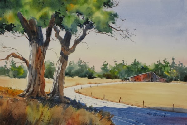
...represented simply as a shape diminishing with distance, a light value, some shadows to define its surface, a few scrapes and lines to suggest ruts, some spatter, and some weeds growing in the ruts. Once you have mastered this symbol, suggesting a simple gravel road in your paintings becomes routine. And look at the foreground deciduous tree symbols in this painting… rough brush marks to suggest bark, light on one side where the sun hits, a mass of color for foliage, with some rough edges. suggested leaves and a few stray branches, and a dark shadow underneath the crown. If these trees were further away, we’d paint very little of the detail (rough bark, suggested leaves) and just stick with their silhouette.
Now take a look at the evergreen forest in Sound of Silence...
The entire forest is a single symbol.. a green mass, with yellow and orange highlights and some value variation, some rough edges, and evergreen tree shapes sticking up above the major mass. It’s darker at the bottom to anchor it to the ground. There are a few trunks and branches suggested by scraping some paint away, and a few hanging branches are indicated at the edge of the shape. Don’t forget that a good shape has incidents at the edges - see Artist Tip #21 to refresh your memory of this. For the forest on the right, smaller and further away, we use the same symbol but greatly simplified, just a mass of color with a few tree shapes sticking up. If, instead of developing this symbol, we tried to paint exactly what we see, we would have a very tight-looking and less interesting painting, with lots of individual trees and branches. The overall shape is the thing!
Now consider the water and reflections in Off Port Clyde...
The calm water is indicated by just a few soft horizontal lines, and gradual darkening as it comes toward the viewer. The slightly random hard-edged reflection also suggests that the water is calm. Note that in this painting, the water, sky, and distant land are all symbols, while the boat itself, the subject of the painting, is rendered in detail.
Early Snowfall also shows calm water. You can see the horizontal lines, but here a wet-into-wet soft reflection is used. Both hard- and soft-edge reflections are legitimate symbols of reflections of objects in calm water.
In Beyond the Surf, we see surf and rough water....
There are no reflections. The rough water is indicated by some thin, rough white horizontal areas representing far-away waves and surf. The pounding surf by the shore is simply a random white shape, with a rough and soft top edge, and some shading down low to represent the shadow in actual surf. Once you master symbols like this, you can quickly indicate a rough sea, regardless of the actual weather outside.
In our next Artist Tip, we’ll take a look at a few more symbols for you to consider, to ensure that this idea is firmly established in your approach to your paintings. If you want your representational painting to look “loose” and not photographic, it’s important to develop symbols for the major ingredients of your typical subjects so you can easily simplify the scene before you, interpreting and enhancing it rather than just “reporting” it.
The simplest symbol of an object is its shape. If we are presented with only the shape of a human figure, with no internal detail at all, we immediately identify it as a figure. This is true of most objects - a flower, a tree, a rock, a fence. The easiest-to-recognize symbols are usually front or side views; a silhouette in 3/4 view has to be done more accurately to be easily recognizable. If we are representing an object far away, and particularly one that is backlit, the shape is all that is needed. For a closer object, we can embellish the shape a bit with some edge and internal details, but need to avoid overdoing it lest our painting becomes too busy and tight-looking.
In Summer on the Farm, we see gravel road…

...represented simply as a shape diminishing with distance, a light value, some shadows to define its surface, a few scrapes and lines to suggest ruts, some spatter, and some weeds growing in the ruts. Once you have mastered this symbol, suggesting a simple gravel road in your paintings becomes routine. And look at the foreground deciduous tree symbols in this painting… rough brush marks to suggest bark, light on one side where the sun hits, a mass of color for foliage, with some rough edges. suggested leaves and a few stray branches, and a dark shadow underneath the crown. If these trees were further away, we’d paint very little of the detail (rough bark, suggested leaves) and just stick with their silhouette.
Now take a look at the evergreen forest in Sound of Silence...
The entire forest is a single symbol.. a green mass, with yellow and orange highlights and some value variation, some rough edges, and evergreen tree shapes sticking up above the major mass. It’s darker at the bottom to anchor it to the ground. There are a few trunks and branches suggested by scraping some paint away, and a few hanging branches are indicated at the edge of the shape. Don’t forget that a good shape has incidents at the edges - see Artist Tip #21 to refresh your memory of this. For the forest on the right, smaller and further away, we use the same symbol but greatly simplified, just a mass of color with a few tree shapes sticking up. If, instead of developing this symbol, we tried to paint exactly what we see, we would have a very tight-looking and less interesting painting, with lots of individual trees and branches. The overall shape is the thing!
Now consider the water and reflections in Off Port Clyde...
The calm water is indicated by just a few soft horizontal lines, and gradual darkening as it comes toward the viewer. The slightly random hard-edged reflection also suggests that the water is calm. Note that in this painting, the water, sky, and distant land are all symbols, while the boat itself, the subject of the painting, is rendered in detail.
Early Snowfall also shows calm water. You can see the horizontal lines, but here a wet-into-wet soft reflection is used. Both hard- and soft-edge reflections are legitimate symbols of reflections of objects in calm water.
In Beyond the Surf, we see surf and rough water....
There are no reflections. The rough water is indicated by some thin, rough white horizontal areas representing far-away waves and surf. The pounding surf by the shore is simply a random white shape, with a rough and soft top edge, and some shading down low to represent the shadow in actual surf. Once you master symbols like this, you can quickly indicate a rough sea, regardless of the actual weather outside.
In our next Artist Tip, we’ll take a look at a few more symbols for you to consider, to ensure that this idea is firmly established in your approach to your paintings. If you want your representational painting to look “loose” and not photographic, it’s important to develop symbols for the major ingredients of your typical subjects so you can easily simplify the scene before you, interpreting and enhancing it rather than just “reporting” it.
Labels:
artist tips
Sunday, November 3, 2013
Artist Tip #21 - Good Shapes
In artist tip #9, we introduced the Elements of Design - the elements we have to work with to create our paintings. The first element we discussed was shape. Our entire painting is made up of shapes. But what makes a "good" shape - one that is pleasing, interesting, engaging, and not boring to the viewer? That's what we'll be talking about in this artist tip. In the following, I'll take you on a journey from a bad shape to a good shape, based on my personal experience, and what I've learned from some very accomplished artists.
To begin, let's consider a very simple painting of a barn, rendered in only two values and one color, so that it's simply a shape:
Unfortunately, this is a very boring shape. Any shape that "fits into" an approximate square or circle, as this one does, seems boring. There is too much sameness for it to be interesting. So, let's try to make this shape better by moving it from nearly a square to an oblong:
That's a bit better. This is definitely less boring, but it's not going to hold anyone's interest for too long. Let's try something else - let's give it a diagonal or oblique "thrust":
Now we're seeing a more interesting shape. But we're not there yet. Take a look at this version:
Here, we've added shapes and lines all around the edge of the previous version - a cupola, a weather vane, smoke stacks, shrubs, fence posts, tree limbs, a utility pole with wires, a road - that all connect with the basic barn shape. They lock the shape into its environment, rather than leaving it looking like a cutout pasted on. And they add lots of interest - there is plenty for the viewer's eye to wander over in this version.
So I suggest that a "good" shape has the following major characteristics:
There are many design errors that can lead to a boring painting, but one of the major ones is not paying attention to making good shapes. Whenever you're working on a painted shape, think about keeping its major dimensions unequal, giving it an oblique character, and adding plenty of small incidents at its edges to lock it into the rest of the painting and to make it interesting to the viewer. And these characteristics are automatically transferred to the other shapes touching this shape - in this case, to the negative space of the background.
One of the reasons I enjoy painting ships is that they automatically create good shapes - their hulls are unequal, oblique, even curved shapes, and the masts, rigging, and sails produce many edge incidents.
If you'd like to review some of my past artist tips, you can find them all by scrolling down to the search box in the right-hand column and typing in "artist tips".
To begin, let's consider a very simple painting of a barn, rendered in only two values and one color, so that it's simply a shape:
Unfortunately, this is a very boring shape. Any shape that "fits into" an approximate square or circle, as this one does, seems boring. There is too much sameness for it to be interesting. So, let's try to make this shape better by moving it from nearly a square to an oblong:
That's a bit better. This is definitely less boring, but it's not going to hold anyone's interest for too long. Let's try something else - let's give it a diagonal or oblique "thrust":
Now we're seeing a more interesting shape. But we're not there yet. Take a look at this version:
Here, we've added shapes and lines all around the edge of the previous version - a cupola, a weather vane, smoke stacks, shrubs, fence posts, tree limbs, a utility pole with wires, a road - that all connect with the basic barn shape. They lock the shape into its environment, rather than leaving it looking like a cutout pasted on. And they add lots of interest - there is plenty for the viewer's eye to wander over in this version.
So I suggest that a "good" shape has the following major characteristics:
- two different dimensions
- oblique
- incidents at the edges
There are many design errors that can lead to a boring painting, but one of the major ones is not paying attention to making good shapes. Whenever you're working on a painted shape, think about keeping its major dimensions unequal, giving it an oblique character, and adding plenty of small incidents at its edges to lock it into the rest of the painting and to make it interesting to the viewer. And these characteristics are automatically transferred to the other shapes touching this shape - in this case, to the negative space of the background.
One of the reasons I enjoy painting ships is that they automatically create good shapes - their hulls are unequal, oblique, even curved shapes, and the masts, rigging, and sails produce many edge incidents.
If you'd like to review some of my past artist tips, you can find them all by scrolling down to the search box in the right-hand column and typing in "artist tips".
Labels:
artist tips
Subscribe to:
Posts (Atom)