Color has three attributes:
- Hue: the name of the color (red, blue, etc.)
- Chroma: the brightness/grayness or purity of the color
- Value: the lightness or darkness of the color
Let's start with hue. The best way to discuss this is to take a look at a typical color wheel:
Warm and cool are attributes that we assign to families of colors, as shown. It's easy to see where the terms come from. Often in painting, it's more important to focus on warm and cool areas than on the particular colors we use.
The next attribute of color is chroma. The brightest (highest chroma) any paint will be is when it's straight out of the tube. When it's mixed with any other color, its chroma will decrease. Here is an example of a complete chroma range for blue and red, from the highest chroma all the way to gray:
Colors can be "grayed" by mixing with their complements (colors on the other side of the color wheel) or by mixing with black. Artists have found that the most pleasing grays in their painting are not made from diluting black (or mixing it with white), but by mixing complements.
Hue and chroma can be pictured together using a complex color wheel:
Here, hue still corresponds to the "clock" position on the wheel, but the colors get grayer as we approach the center of the wheel. If the graphic went all the way to the middle, we would find a gray circle there.
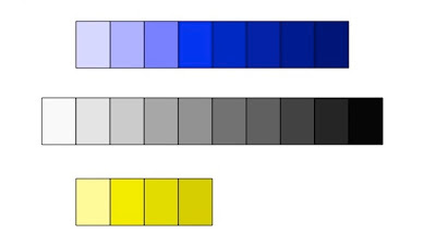
Perhaps the most important attribute to understand, and the one that is hardest to control, is color value. We covered simple value in the previous tip, showing a value scale that went from white to black (a gray scale). But every color also has its own value scale. Here are value scales for blue and yellow, compared to a gray scale:
The best way to understand color value is to "squint" so that most of the color we see disappears. Here when we squint and can't see much color, we can see that the blue and yellow scales line up with the gray scale. Also note that although both blue and yellow can be very light, only blue can be really dark. Yellow cannot be made to be dark without changing its color to brown. So yellow has a much smaller "color dynamic range" than blue and most other colors. You just cannot paint a dark yellow! There are many ways to adjust the value of our paint, including mixing it with complements, nearby colors, and black. Often, as we adjust value, we also adjust chroma. The best way to master these changes is to experiment and try them for ourselves, until we understand how we can change each tube color that we use in both chroma and value.
Next time, we'll start our discussion of the principles of design.
If you'd like to have images of my latest paintings, my art activity schedule, and a link to each new artist tip delivered directly to your inbox, sign up for my e-newsletter Here.


1 comment:
We all need challenges in our life to keep motivated. I really had a great time scanning
and reading your blog site and i was so amazed with your great artwork. I do hope you could
inspire more readers. You can also visit my site for some interesting stuff.
n8fan.net
www.n8fan.net
Post a Comment