The simplest symbol of an object is its shape. If we are presented with only the shape of a human figure, with no internal detail at all, we immediately identify it as a figure. This is true of most objects - a flower, a tree, a rock, a fence. The easiest-to-recognize symbols are usually front or side views; a silhouette in 3/4 view has to be done more accurately to be easily recognizable. If we are representing an object far away, and particularly one that is backlit, the shape is all that is needed. For a closer object, we can embellish the shape a bit with some edge and internal details, but need to avoid overdoing it lest our painting becomes too busy and tight-looking.
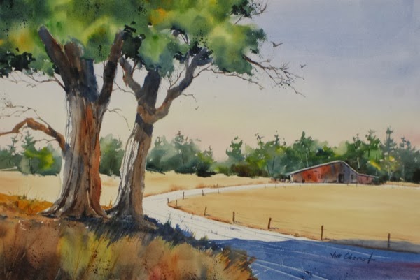
In Summer on the Farm, we see gravel road…

...represented simply as a shape diminishing with distance, a light value, some shadows to define its surface, a few scrapes and lines to suggest ruts, some spatter, and some weeds growing in the ruts. Once you have mastered this symbol, suggesting a simple gravel road in your paintings becomes routine. And look at the foreground deciduous tree symbols in this painting… rough brush marks to suggest bark, light on one side where the sun hits, a mass of color for foliage, with some rough edges. suggested leaves and a few stray branches, and a dark shadow underneath the crown. If these trees were further away, we’d paint very little of the detail (rough bark, suggested leaves) and just stick with their silhouette.
Now take a look at the evergreen forest in Sound of Silence...
The entire forest is a single symbol.. a green mass, with yellow and orange highlights and some value variation, some rough edges, and evergreen tree shapes sticking up above the major mass. It’s darker at the bottom to anchor it to the ground. There are a few trunks and branches suggested by scraping some paint away, and a few hanging branches are indicated at the edge of the shape. Don’t forget that a good shape has incidents at the edges - see Artist Tip #21 to refresh your memory of this. For the forest on the right, smaller and further away, we use the same symbol but greatly simplified, just a mass of color with a few tree shapes sticking up. If, instead of developing this symbol, we tried to paint exactly what we see, we would have a very tight-looking and less interesting painting, with lots of individual trees and branches. The overall shape is the thing!
Now consider the water and reflections in Off Port Clyde...
The calm water is indicated by just a few soft horizontal lines, and gradual darkening as it comes toward the viewer. The slightly random hard-edged reflection also suggests that the water is calm. Note that in this painting, the water, sky, and distant land are all symbols, while the boat itself, the subject of the painting, is rendered in detail.
Early Snowfall also shows calm water. You can see the horizontal lines, but here a wet-into-wet soft reflection is used. Both hard- and soft-edge reflections are legitimate symbols of reflections of objects in calm water.
In Beyond the Surf, we see surf and rough water....
There are no reflections. The rough water is indicated by some thin, rough white horizontal areas representing far-away waves and surf. The pounding surf by the shore is simply a random white shape, with a rough and soft top edge, and some shading down low to represent the shadow in actual surf. Once you master symbols like this, you can quickly indicate a rough sea, regardless of the actual weather outside.
In our next Artist Tip, we’ll take a look at a few more symbols for you to consider, to ensure that this idea is firmly established in your approach to your paintings. If you want your representational painting to look “loose” and not photographic, it’s important to develop symbols for the major ingredients of your typical subjects so you can easily simplify the scene before you, interpreting and enhancing it rather than just “reporting” it.


No comments:
Post a Comment