Friday, December 25, 2015

Scottish Cottage - Original Watercolor Painting

We came upon this rural Scottish cottage while we were touring in the Stirling, Scotland area in May, 2014.

If you'd like to purchase this 11" x 15" original watercolor painting for $200 including shipping within the United States, you can do it securely on my website www.jimoberst.com (click on the image). There are additional paintings for sale there, and my smaller paintings are available on my other website www.weeklywatercolor.com.  Add a unique original painting to your collection!

Join my fine art e-newsletter mailing list Here, and receive new painting updates, useful artist and art collector tips, and special offers, right in your inbox!  And when you subscribe, you'll receive a 10% instant rebate valid for one month.

Tuesday, November 10, 2015

Farm Country Autumn - Original Watercolor Painting

The turning trees are striking this year in Ohio. This is a farmhouse in Farifield County.

If you'd like to purchase this 11" x 15" original watercolor painting for $200 including shipping within the United States, you can do it securely on my website www.jimoberst.com (click on the image). There are additional paintings for sale there, and my smaller paintings are available on my other website www.weeklywatercolor.com.  Add a unique original painting to your collection!

Join my fine art e-newsletter mailing list Here, and receive new painting updates, useful artist and art collector tips, and special offers, right in your inbox!  And when you subscribe, you'll receive a 10% instant rebate valid for one month.

Friday, June 5, 2015

Forglen Lodge, Scotland - Original Watercolor Painting

In May 2014, we spent a week in this enchanting gatehouse on the Forglen Estate near Turiff, Aberdeenshire, Scotland.

If you'd like to purchase this 11" x 15" original watercolor painting for $200 including shipping within the United States, you can do it securely on my website www.jimoberst.com (click on the image). There are additional paintings for sale there, and my smaller paintings are available on my other website www.weeklywatercolor.com.  Add a unique original painting to your collection!

Join my fine art e-newsletter mailing list Here, and receive new painting updates, useful artist and art collector tips, and special offers, right in your inbox!  And when you subscribe, you'll receive a 10% instant rebate valid for one month.

Thursday, May 28, 2015

Delightful Floral - Original Watercolor Painting

A lovely bunch of flowers, perfect for springtime.

If you'd like to purchase this 11" x 15" original watercolor painting for $200 including shipping within the United States, you can do it securely on my website www.jimoberst.com (click on the image). There are additional paintings for sale there, and my smaller paintings are available on my other website www.weeklywatercolor.com.  Add a unique original painting to your collection!

Join my fine art e-newsletter mailing list Here, and receive new painting updates, useful artist and art collector tips, and special offers, right in your inbox!  And when you subscribe, you'll receive a 10% instant rebate valid for one month.

Sunday, May 10, 2015

Rose Duet - Original Watercolor Painting

Two roses.

If you'd like to purchase this 11" x 15" original watercolor painting for $200 including shipping within the United States, you can do it securely on my website www.jimoberst.com (click on the image). There are additional paintings for sale there, and my smaller paintings are available on my other website www.weeklywatercolor.com.  Add a unique original painting to your collection!

Join my fine art e-newsletter mailing list Here, and receive new painting updates, useful artist and art collector tips, and special offers, right in your inbox!  And when you subscribe, you'll receive a 10% instant rebate valid for one month.

Thursday, April 30, 2015

Balcony Garden - Original Watercolor Painting

A lovely garden of flowerpots on the balcony of a quaint European building. I drew and painted this from a reference photo provided by Fabio Cembranelli in one of his workshops.

If you'd like to purchase this 15" x 11" original watercolor painting for $200 including shipping within the United States, you can do it securely on my website www.jimoberst.com (click on the image). There are additional paintings for sale there, and my smaller paintings are available on my other website www.weeklywatercolor.com.  Add a unique original painting to your collection!

Join my fine art e-newsletter mailing list Here, and receive new painting updates, useful artist and art collector tips, and special offers, right in your inbox!  And when you subscribe, you'll receive a 10% instant rebate valid for one month.

Saturday, April 25, 2015

Artist Tip #33 - Painting "Lobstah" Step-by-Step

In this artist tip, I'll take you through my process of painting a New England seascape.  I enjoy painting seascapes, and have visited the Maine coast often to gather reference material for my paintings.  This painting is of a lobster boat I saw in the harbor in Rockland, Maine, a few years ago.

I begin all of my watercolor paintings with a simple pencil sketch on dry watercolor paper.  For this painting I used Arches 140# cold-press paper cut to 7.5x11".  I use a #2 mechanical lead pencil and a white plastic eraser.  I try to draw enough details to provide an accurate guide for my painting, but not so much that I cannot make changes as I paint:


Before I begin painting, I wet the paper on both sides, and then dry the top surface with a towel.  The dry surface holds painted edges, while the water within the paper makes it easier to achieve smooth washes with no blooms.

I rewet the sky to keep it soft, and then painted it with a light wash of blue and purple, leaving some white areas to represent wispy clouds.  I extended this wash down through the horizon.  Next, I painted the distant hills while the sky was still damp to give the hills a soft edge and a feeling of distance:


I then painted the water, leaving some white areas to represent foam. I painted around the boat.  I don't like to use masking fluid because it can leave hard edges, and can make a painting look "tight" or "rigid".

Next I painted the large areas and major shapes of the boat.  Figures always make a landscape of a seascape painting more interesting.  Shadows are also important.  It's good to have both white and darks in your center of interest to draw the eye to it:


To complete the painting, I added more details like the masts and rigging, the sea birds, and the distant sailboats.  I used white gouache for some of these shapes, which works fine for thin lines and very small areas.  I also added some dry brush strokes in the foreground water to give it more interest and bring it forward:


This is my usual approach to landscapes and seascapes:  first, paint earth and sky; second; paint the major shapes of the subject; finally, add details for interest.

As of this posting, the painting Lobstah is still available for purchase for $100 including shipping in the US.  Just click here for more details.

I hope you found this step-by-step explanation useful.  I've also turned this step-by-step demo into a YouTube slide show for your enjoyment and education.  Just click here to watch the video.

I hope you found this artist tip useful.  If you'd like to get artist and art collector tips like this delivered directly to your inbox every few weeks, sign up for my fine art e-newsletter here!  When you subscribe, you'll receive a 10% instant rebate valid for one month for any of my paintings.

Tuesday, March 31, 2015

See Through - Original Watercolor Painting

I've painted this barn a few times. I love the colors of the old wood, and the guy with hands on hips "supervising".

If you'd like to purchase this 13" x 22" original watercolor painting for $275 including shipping within the United States, you can do it securely on my website www.jimoberst.com (click on the image). There are additional paintings for sale there, and my smaller paintings are available on my other website www.weeklywatercolor.com.  Add a unique original painting to your collection!

Join my fine art e-newsletter mailing list Here, and receive new painting updates, useful artist and art collector tips, and special offers, right in your inbox!  And when you subscribe, you'll receive a 10% instant rebate valid for one month.

Sunday, March 15, 2015

Art Collector Tip #6 - Wall Arrangements

Most of us art collectors have many more things that we'd like to display than wall space to display them.  One way to get our collection of 2-D artwork out of the closet and onto the wall is to create a few wall arrangements where we can display many pieces of artwork in an artistic and complementary way.  I'll discuss some thoughts on creating pleasing wall arrangements in this article.

First, a comment on the layout process.  What I do when planning a wall arrangement is first to mark off the size and shape of the area on the floor, using some tape as an outline.  I then place the artwork in that area, trying different arrangements until I hit upon one that I like.  I then measure where all the hangers would be, make a diagram on a piece of paper, and use that to attach the hangers to the wall.  I then hang the artwork.  Whatever extra holes are caused by small adjustments needed in the position of the hangers remain hidden behind the artwork.  There are certainly other approaches, but this one works for me.

Now, to the arrangement itself.  Arranging artwork on a wall area is similar to composition or design of a painting on paper or canvas.  Most often we have a rectangular area to work with, just like most paintings, but there are exceptions.  As in a painting, balance is recommended for a pleasing arrangement.  We discussed the principle and types of balance in Artist Tip #13, from which I quote:

"The principle of Balance that we will discuss next applies mostly to shapes, though it can also apply to other elements - particularly value.  An unbalanced painting, with most of its shapes on one side, is disturbing to view.  If we think of balance in terms of weight, large shapes "feel" heavier than small shapes, and dark shapes "feel" heavier than light shapes.  In addition, balance can be either formal, with similar shapes in similar positions on both sides of the painting, or informal, with larger shapes on one side close to the center, and small shapes on the other side, nearer the painting edge.  Think of informal balance on a seesaw or teeter-totter, with a large child near the fulcrum balancing a smaller child near the end, and you'll have the idea.  We generally find informal balance more pleasing than formal balance.  Balance applies to paintings horizontally, not vertically - a painting that is "heavier" on the bottom "feels" fine.  But if it's heavier on the top, it can seem odd."

Although these comments on painting design cannot be fully applied to wall arrangements, they do help us to think about how to arrange paintings on a rectangular wall space.  In particular, we can choose whether to create a formal or informal arrangement, depending on the space and the room.  Here is an example of a formal arrangement of three of my weekly watercolor paintings:


Here we have a completely balanced arrangement, laid out on the floor...  identical size frames, equally spaced, with similar frame styles and mat colors, and related subjects - all urban European scenes.  This client planned to hang these paintings above her fireplace to create a more interesting arrangement than a single large painting would provide.

Next, let's take a look at a larger arrangement that is less formal.  This is an arrangement of some of my wife Jeanette's needlework on a wall in our study:


Note that the sizes, frames, mats, and subject matter are all different.  The only unifying element is that they are all needlework pieces.  Although the arrangement is roughly rectangular, not all of the outside edges of the frames line up with one another.  It would be even more informal if there were overlap between the vertical "columns".

Finally, one can mix different types of artwork and even 3-D objects in a wall arrangement.  Here is an example from our kitchen:


This wall arrangement includes needlework, a metal sculpture, and a decorative clock, to give a varied and pleasing arrangement.

So these types of arrangements of artwork can create very interesting displays, while increasing the effective wall space we have to display our art.  We can choose to arrange the artwork in a formal or informal pattern.  And we can include pieces related by medium, size, or subject matter, or just create a varied display of our favorites.  Several smaller paintings can thus be used effectively in much larger spaces.

I hope you have found this art collector tip useful, and food for thought.  If you'd like to get artist and art collector tips like this delivered directly to your inbox every few weeks, sign up for my fine art e-newsletter here!  When you subscribe, you'll receive a 10% instant rebate valid for one month for any of my paintings.

Thursday, March 12, 2015

A Threatening Sky - Original Watercolor Painting

Waves and wind are starting to intensify as a storm moves in.

If you'd like to purchase this 11" x 15" original watercolor painting for $200 including shipping within the United States, you can do it securely on my website www.jimoberst.com (click on the image). There are additional paintings for sale there, and my smaller paintings are available on my other website www.weeklywatercolor.com.  Add a unique original painting to your collection!

Join my fine art e-newsletter mailing list Here, and receive new painting updates, useful artist and art collector tips, and special offers, right in your inbox!  And when you subscribe, you'll receive a 10% instant rebate valid for one month.

Sunday, February 22, 2015

Artist Tip #32 - Perspective Made Simple

In this artist tip we'll cover the basics - and I mean the very basics - of perspective.  Perspective is not really part of "design" per se, but correct perspective is very important to a realistic painting's "believability".  If you paint exactly what is before you, you need not know anything about perspective - all the visual information you need is right there.  But if you move shapes, add figures, change lighting, etc., you need to know how shadows, reflections, and perspective work.  We've already covered cast shadows in Artist Tips #4, #5, and #6, and reflections in Artist Tip #7.

Before we dive into perspective, it's very important to understand the horizon line, covered in Artist Tip #30.  I suggest you review that post before proceeding here.

Perspective is the art of representing a 3-dimensional scene on a 2-dimensional surface so as to give the correct impression of the objects' relative sizes and positions when viewed from a particular point.  There are 3 major conventions of perspective - designated as 0-point, 1-point and 2-point perspective - and these refer to the behavior on the painting surface of lines which are parallel in reality.  For simplicity, we'll consider only lines that are parallel to each other and to the horizontal surface.  All horizontal lines terminate in a vanishing point on the horizon line.  As defined in Artist Tip #30, the horizon line is the distant horizontal line at your eye level as you're looking at the scene.

In 1-point perspective, parallel horizontal lines in the picture plane all converge on a single point on the horizon line called the vanishing point, usually within the painting frame.  This happens when we look at a scene where we can only see one side of the included buildings, roads, etc.  Here is an example - Seine-Side Booksellers - where the buildings on the right and the tree line on the left "hem us in" between them:

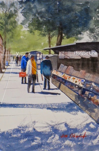
Here the single vanishing point is approximately at point "V", and is on the horizon line.  Note that often a painting looks more "relaxed" and less mechanical if a small vanishing "area" is chosen rather than a strict point.

Also note where the heads of the adults are - all are on or near the horizon line, regardless of how close or far they are from the viewer, because they and the viewer are all standing on the same level sidewalk.  The position of the feet determines how close the figures look; the position of their heads indicates how tall they are.  This is very important information to be aware of if you are adding figures or moving them around in your scenes.  If the sidewalk cracks and the book stands were not parallel to each other, they would not point to the same vanishing point.

Here is one other example of a single vanishing point.  But in Spruce Head Wharf  we can only see buildings on the left side, and the single vanishing point is beyond the edge of the painting:


Here, note that the viewpoint is above the two figures, so their heads are lower than the horizon line.  If the viewer were lower - say, on a boat in the water near the bottom of the painting, the heads would be above the horizon line.

In 2-point perspective, we see both sides of, for example, a building, and the horizontal parallel lines from the different sides have a different vanishing point.  In the painting Gambrel Roof Barn, we see both sides of the barn, so there are two different vanishing points:


Both happen to be beyond the edges of the painting.  If the viewpoint were closer to the barn, we would see more acute angles, and the vanishing points would move in toward the painting.

Now, if the viewer stands directly in front of a shape, like a building, and far enough away so that one side is perpendicular to him/her, and the other sides cannot be seen, perspective degenerates into entirely parallel lines, or 0-point perspective.  In this case, the parallel lines in reality remain parallel in the painting, as in the painting Cheyenne Station:


This is by far the simplest type of perspective - no perspective at all!  Lines that are parallel and horizontal in the "real world" stay that way in the painting.

I hope you've found this brief discussion of the basics of perspective useful.  To cover perspective in depth would take an entire book, but what I've covered here will stand most realistic painters in good stead.

I hope you found this artist tip useful.  If you'd like to get artist and art collector tips like this delivered directly to your inbox every few weeks, sign up for my fine art e-newsletter here!  When you subscribe, you'll receive a 10% instant rebate valid for one month for any of my paintings.

Sunday, January 11, 2015

Art Collector Tip #5 - Artistic Styles

In Art Collector Tip #2, I proposed that there's one best reason to collect fine art...  you love it, and you want to see it in your home or office every day, for a long, long time.  Nevertheless, it can be useful to think a bit about the various styles of art, to assist in developing your own personal artistic taste.

In my opinion, the art "professionals" have gone a bit overboard in defining various styles of art.  Wikiart describes no less than 140 different art styles!  This can be overwhelming for most folks who enjoy art, including me.  So here I suggest a simpler way for art collectors to think about or "characterize" the art that they see.

I myself imagine various art styles spaced along a continuum, a line stretching from photorealism to completely non-objective abstract art.  All of the 140 art styles mentioned above fall somewhere along this spectrum:

    photo                 painterly            objective          non-objective
|----+------------------+------------------+------------------+-------|
                  realism                                            abstraction

Photorealism is a method of painting which reproduces exactly the actual subject being painted, with all of its details.  It may include some slight exaggeration of graininess, color, and/or value, but only in a way to further emphasize the reality of the subject.  Photorealistic paintings can be very impressive, although they resemble very clear photographs (perhaps with some color and value enhancement) of the subject.  I'm not a photorealistic painter - I don't have the patience for it.  However, some of my paintings do have a very realistic center of interest, which is closer to photo- than to painterly-realism.  The sailboat in this painting is an example of this:


As we move along the line between photorealism and non-objective art, we next encounter realistic art that is in some way "painterly".  This art represents an actual subject, although it may be "simplified" and have very obvious color, shape, and texture distortions and enhancements to differentiate it from a photograph.  Many identifiable painting "styles" fall into this category, including impressionism, a favorite of many collectors.  I'd put most of my artwork into this category.  Here is an example:


In this painting the barn and landscape are very recognizable, but with simplified shapes and figures, and exaggerated color.

As we proceed along this continuum, we reach the zone of abstraction.  We first encounter abstract, objective art based on an actual subject, but with significant changes so that the artwork is inspired by, rather than directly representing, the subject.  Colors may have no relationship to the original subject, shapes and lines may be very distorted, and much of the painting achieves its impact via color, shape, and line.  Here is perhaps my only painting in this style - the "story" is clear, but it's certainly not an accurate depiction of a "real" subject:


Finally, we reach non-objective abstraction.  These paintings achieve their impact and interest entirely through abstract design, color, and texture, and are uninformed by any real subject.  The following example is a painting that depends entirely on lines, shapes, color, and value unrelated to any real-world subject.  One fun aspect of abstract art is that viewers can often "find" meaning in a painting that is specific to themselves.  This painting reminds me of kites flying, although I had no thought of kites when I composed it:


I imagine that some serious art students who read this article may feel that I've done a disservice to the many important styles of painting that have been developed through the years.  But my goal here has been not to give a comprehensive historical review of artistic styles but to present a simple "model" of painting styles to give collectors a way of thinking about the various paintings that appeal to them.

If you've found this information valuable, please join my fine art e-newsletter mailing list Here, and receive new painting updates, useful artist and art collector tips, and special offers, right in your inbox!  And when you subscribe, you'll receive a 10% instant rebate valid for one month.