Sunday, January 27, 2013

Artist Tip #10 - Color as a Design Element

Here we complete our discussion of the elements of design with color.

Color has three attributes:

  • Hue: the name of the color (red, blue, etc.)
  • Chroma: the brightness/grayness or purity of the color
  • Value: the lightness or darkness of the color

Let's start with hue.  The best way to discuss this is to take a look at a typical color wheel:


Warm and cool are attributes that we assign to families of colors, as shown.  It's easy to see where the terms come from.  Often in painting, it's more important to focus on warm and cool areas than on the particular colors we use.

The next attribute of color is chroma.  The brightest (highest chroma) any paint will be is when it's straight out of the tube.  When it's mixed with any other color, its chroma will decrease.  Here is an example of a complete chroma range for blue and red, from the highest chroma all the way to gray:


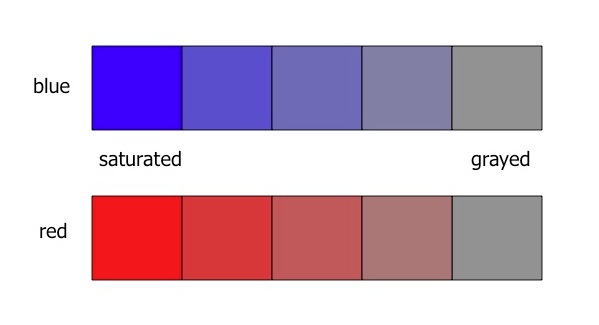
Colors can be "grayed" by mixing with their complements (colors on the other side of the color wheel) or by mixing with black.  Artists have found that the most pleasing grays in their painting are not made from diluting black (or mixing it with white), but by mixing complements.

Hue and chroma can be pictured together using a complex color wheel:

Here, hue still corresponds to the "clock" position on the wheel, but the colors get grayer as we approach the center of the wheel.  If the graphic went all the way to the middle, we would find a gray circle there.

Perhaps the most important attribute to understand, and the one that is hardest to control, is color value.  We covered simple value in the previous tip, showing a value scale that went from white to black (a gray scale).  But every color also has its own value scale.  Here are value scales for blue and yellow, compared to a gray scale:


The best way to understand color value is to "squint" so that most of the color we see disappears.  Here when we squint and can't see much color, we can see that the blue and yellow scales line up with the gray scale.  Also note that although both blue and yellow can be very light, only blue can be really dark.  Yellow cannot be made to be dark without changing its color to brown.  So yellow has a much smaller "color dynamic range" than blue and most other colors.  You just cannot paint a dark yellow!  There are many ways to adjust the value of our paint, including mixing it with complements, nearby colors, and black.  Often, as we adjust value, we also adjust chroma.  The best way to master these changes is to experiment and try them for ourselves, until we understand how we can change each tube color that we use in both chroma and value.

Next time, we'll start our discussion of the principles of design.

If you'd like to have images of my latest paintings, my art activity schedule, and a link to each new artist tip delivered directly to your inbox, sign up for my e-newsletter Here.

Tuesday, January 8, 2013

Sleepy Valley - Original Watercolor Painting

On a hazy summer day, cattle graze near the river in this sleepy valley.

If you'd like to purchase this 15" x 22" original watercolor painting for $300 including shipping within the United States, you can do it securely on my website www.jimoberst.com (click on the image). There are additional paintings for sale there, and my smaller paintings are available on my other website www.weeklywatercolor.com.  Add a unique original painting to your collection!

Sunday, January 6, 2013

Artist Tip #9 - Introduction to Design - Elements

Normally, when we begin our artistic journey, we are entirely focused on learning to draw and handle our art materials in order to be able to faithfully represent the scene before us.  Typically, our next step is to learn design so we can rearrange and modify what we see in order to make the resulting painting more pleasing to the viewer at the expense of departing a bit from reality.  Finally we reach toward developing a purpose, message, or emotion in our artwork.  These steps don't follow a strict progression; we continue to develop our skills and methods as we begin to apply design principles to our paintings, and continue both while reaching for meaning and emotion in our artwork.

My first eight artist tips focused on the first stage: convincingly representing reality, and we're not yet done with that.  But I'd like to now begin our journey into painting design.  Before considering design principles and guidelines, we must first understand what the elements are that we artists have to work with.  There's no magic here; we're already familiar with these seven elements of design:

  • Shapes
  • Lines
  • Size
  • Direction
  • Texture
  • Value
  • Color

A few words about each will ensure that we are all talking the same language when we get to the actual information on design:

Shapes can be outlined or not, and with straight sides, curved sides, or both.  Shapes can be of any size, and can be in any orientation or direction.

Lines can be straight or curved, thick or thin, and of various lengths and directions.

As we can see, size and direction are specific characteristics of shapes and lines.  The last 3 elements are also characteristics of shapes and lines, but are worthy of a bit more discussion.

Texture is a characteristic of both the insides and edges of shapes.  Three basic textures can be achieved in most painting mediums:

  • Hard or smooth
  • Rough
  • Soft

These are illustrated in the following diagram using watercolor on paper:


Value is the lightness or darkness of a shape or line.  The easiest way to think of value is as a gray scale:


One use of the gray scale was already covered in Artist Tip #4 - Understanding Cast Shadows (Part 1), where we discussed the value difference between a surface in sunlight and in shadow.  However, that was in pursuit of the first stage goal of learning to convincingly represent reality.  As a design element, value can be manipulated to improve the impact of our painting at the expense of accurately representing reality.

Color is the last element we have to work with, and it is complex enough to deserve a separate discussion in our next artist tip.

The very best reference I've found on the basics of painting design are several chapters in Tony Couch's classic book, Watercolor You Can Do It.  Although it is written from a watercolor perspective, most of its design information is applicable to all mediums.  Much of what I have learned about painting design was gleaned from Tony's book and workshops.