Saturday, December 13, 2014

Artist Tip #31 - Treatment at the Edge

I've mentioned before that we realistic painters are in the illusion business - we're magicians.  We "represent" a limitless, 3-dimensional, moving reality in a 2-dimensional, limited-size, stationary painting.  Unlike nature, the surface to which we apply paint, called a "ground" - paper, canvas, wood, etc. - has a limit, or "frame".  Once we make a positive shape within its rectangle, we have automatically created negative shapes around that positive shape, and these are also very important.

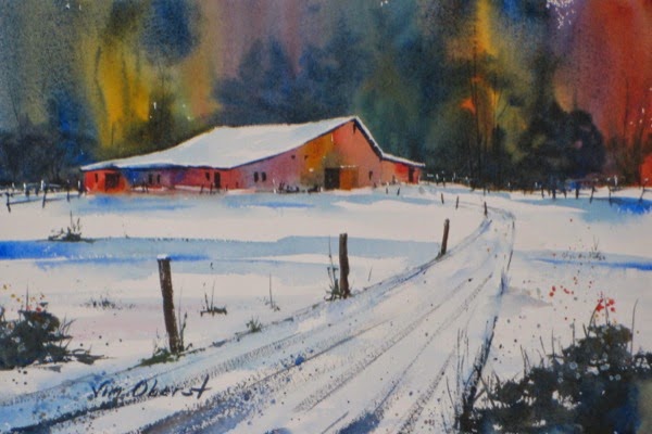
One of our goals as artists is to entertain the viewer, and keep his/her eyes on our painting as long as possible.  How we handle the edges of our painting can affect this.  In particular, it's helpful to avoid running long oblique lines off the lower edge of the painting, and to avoid having a white or bright area at the edge of the painting.  These little tricks help to keep the viewer's eyes inside our painting, rather than running off its edge.

Here is an example where I tried to avoid these two things.  The long upper edge of the dirt road was run off the side, rather than the bottom or corner, of the painting.  And the shadow in the foreground over the light-valued road acts as a "block" to keep the eye from wandering off the bottom of the painting:


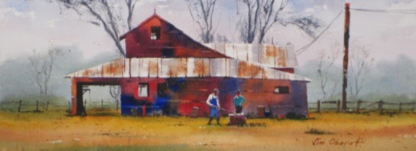
Another design issue to be wary of is to avoid having the edge of a shape near and parallel to the edge of the painting, with a small empty space between the shape and the edge.  This tends to draw attention to the edge, which is not where we want our viewer's eyes to be focused.  One should either separate the object from the edge and "lean" it so it is not parallel to the edge, or overlap it with the edge of the painting.  This painting shows the latter approach, where the vertical tree at the edge of the painting has been overlapped with the edge, thus becoming a visual "stop" to keep the viewer's eyes within the painting:


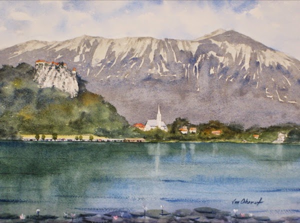
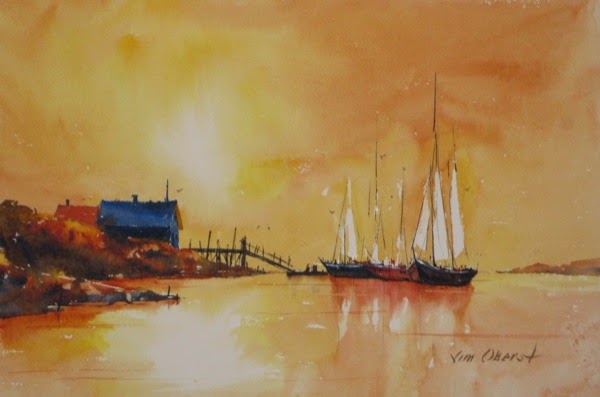
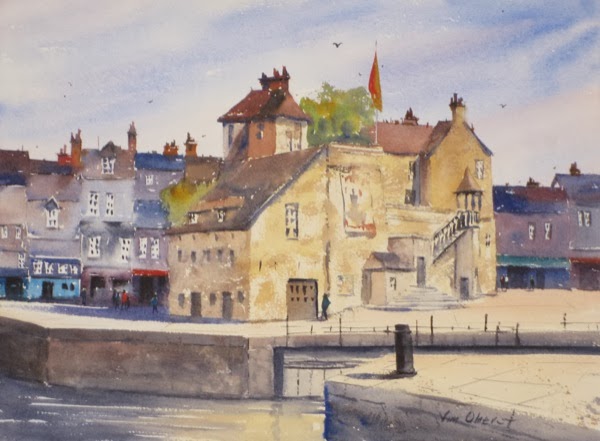
Finally, in general it is good to run shapes off the edge of the painting, to make the edge seem less "real".  Often in beginner's paintings we see trees "stunted" to force their entire crown to fit inside the painting frame, and the artificial look this creates.  The first painting above shows how running trees off the top of the painting looks more natural; it appears that we are looking at the scene through a window.  This same idea applies to anything tall, including sails and ship masts, as in the images below:


I hope you found this artist tip useful.  If you'd like to get artist and art collector tips like this delivered directly to your inbox every few weeks, sign up for my fine art e-newsletter here!  When you subscribe, you'll receive a 10% instant rebate valid for one month for any of my paintings.

Thursday, November 20, 2014

Before the Wind - Original Watercolor Painting

An invigorating day - running before the wind with spinnaker unfurled.

If you'd like to purchase this 11" x 15" original watercolor painting for $200 including shipping within the United States, you can do it securely on my website www.jimoberst.com (click on the image). There are additional paintings for sale there, and my smaller paintings are available on my other website www.weeklywatercolor.com.  Add a unique original painting to your collection!

Join my fine art e-newsletter mailing list Here, and receive new painting updates, useful artist and art collector tips, and special offers, right in your inbox!  And when you subscribe, you'll receive a 10% instant rebate valid for one month.

Sunday, November 9, 2014

Art Collector Tip #4 - All About Paint

Serious art collectors typically want some basic knowledge of the paint and grounds used in the paintings they collect.  In my first Art Collector Tip, I discussed the characteristics and archival quality of the watercolor paper (the ground) that I use.  It this tip I'll discuss the basics of paint, the other main physical ingredient of any painting.

At the simplest level, all paint consists of pigment, which gives the paint its color, and binder, which holds the paint to the surface or ground.  The pigment is identical for all painting mediums; it's the binder which gives various mediums their different physical characteristics.  For every medium there are additives available to improve the paint manufacturing process, hasten or retard drying, assist in mixing, protect the surface, etc., but we will not cover these here - we'll just cover the basics.

The binders for each painting medium are as follows:

  • Watercolor and Gouache: gum (Gouache also includes chalk to provide opacity)
  • Acrylic paint: acrylic resin (similar to house paint)
  • Oil paint: various oils
  • Egg Tempera paint: egg
  • Pastel: gum

It is the binders that give paintings done in various mediums their different "look".  The pigments are identical.

Pigment is a physical substance that is ground into a powder and added to the binder to provide color.  There are two main types of pigment:

  • Inorganic: natural earths or synthetic chemicals
  • Organic: natural vegetable, natural animal, or synthetic organic chemicals

The various manufacturers of artist paints have created some very unique names for each paint color. However, different named paints may be created from exactly the same physical pigment.  Fortunately, these paints are also labeled with a standard pigment naming scheme, so that, for example PB28 (Pigment Blue #28) may be called Cobalt Blue, or Sky Blue, or anything else, but it will be the same basic color regardless of the manufacturer.  There may be other differences due to the exact manufacturing process, but the actual pigment used can be determined by reading the label. There are some "custom" multi-pigment mixtures that cannot be so easily compared.  For example, many greens are actually mixtures of a blue and yellow pigment, and correspondence by reading the label of Sap Green manufactured by different companies is not possible.  Here is a color wheel chart  created by Bruce MacEvoy that shows many of the available artist colors and their corresponding pigments:


Lightfastness or permanence is also an important quality of pigments.  Earths and synthetics are the most lightfast; many of the natural organic compounds fade or change color quickly.  Today there are excellent synthetic replacements for virtually all natural organic pigment colors.  There is a standard lightfastness rating system known as ASTM.  Ratings (in roman numerals) range from I (permanent) to V (very fugitive).  Most of today's artists are very careful to use only paints rated I or II, so their paintings will last for a very long time without suffering any noticeable change in vibrancy or color.

I hope you found this post of interest.  If you'd like to get Artist and Art Collector Tips like this delivered directly to your inbox, sign up for my fine art e-newsletter here!  When you subscribe, you'll receive a 10% instant rebate valid for one month for any of my paintings.

Wednesday, October 29, 2014

Lazy Day - Original Watercolor Painting

This farm building sits just a few miles from where I live in Arkansas.

If you'd like to purchase this 11" x 15" original watercolor painting for $200 including shipping within the United States, you can do it securely on my website www.jimoberst.com (click on the image). There are additional paintings for sale there, and my smaller paintings are available on my other website www.weeklywatercolor.com.  Add a unique original painting to your collection!

Join my fine art e-newsletter mailing list Here, and receive new painting updates, useful artist and art collector tips, and special offers, right in your inbox!  And when you subscribe, you'll receive a 10% instant rebate valid for one month.

Sunday, October 19, 2014

Artist Tip #30 - The Horizon

It's very important for landscape painters to be able to identify the horizon line, and to know how to handle it in their paintings.  According to the dictionary, the horizon is the line at which the earth's surface and the sky appear to meet.  This "line" may or may not be visible in the landscape you're observing.  If you're looking at the sea, where there's nothing "in the way" of the horizon, it can actually be seen.  But there may be features between your eye and the horizon that block your view of it... mountains, trees, or buildings, for example.  In these cases, it's important to be able to judge where that horizon line really is.

In a future artist tip, we'll cover perspective, and you'll learn that all horizontal lines converge in the distance to the horizon line.  But for now, the best way to think of it is as the distant horizontal line at your eye level, when you're looking at the scene.  It may be blocked by closer objects, but it's there none the less.  Here are a few examples of the horizon line.  First, a seascape, where the horizon line is very obvious:


Here is a landscape with a very low horizon line, whose position is much less obvious:


How does one estimate the horizon line in this painting?  Note that it's very clear that you're looking up at the lighthouse - you can see the inside of the turret, and the bottom of the rain gutters.  Also, the sea, which is to the left, cannot be seen even at the lower left of the painting.  So one can deduce that the horizon line is approximately where I've marked it, or even a bit lower.

Here's a painting with a very high horizon line:


Note that when you're looking down at a scene, the horizon line is high.

Choosing the position of the horizon line is part of planning your painting.  You can compose your painting so the horizon line is somewhere near its midpoint, but often more interesting compositions are created by placing the horizon line very high or very low, so that you have an unusual viewing perspective of your subject.

Your center of interest will often be found near the horizon line.  Our comments in Artist Tip #20 about placing the center of interest in an interesting position also hold true about the horizon line.  It's not recommended to put the horizon in the center of the composition - it will split your painting into two equal parts, which is a very boring arrangement.  Put it higher or lower - a 2:1 ratio of area above and below the horizon line leads to a much more interesting composition.  And be extra careful when you use a low horizon line - it's very easy to wind up with a dark horizontal hill or tree line either at the center of the paper, or breaking the picture area up into three equal areas - rather boring.  A high horizon line is much "safer".

If you'd like to get Artist and Art Collector Tips like this delivered directly to your inbox, sign up for my fine art e-newsletter here!  When you subscribe, you'll receive a 10% instant rebate valid for one month for any of my paintings.

Thursday, October 9, 2014

Old Harbor Honfleur - Original Watercolor Painting

The old harbor at Honfleur, France is busy with boats and people dining and shopping.

If you'd like to purchase this 11" x 15" original watercolor painting for $200 including shipping within the United States, you can do it securely on my website www.jimoberst.com (click on the image). There are additional paintings for sale there, and my smaller paintings are available on my other website www.weeklywatercolor.com.  Add a unique original painting to your collection!

Join my fine art e-newsletter mailing list Here, and receive new painting updates, useful artist and art collector tips, and special offers, right in your inbox!  And when you subscribe, you'll receive a 10% instant rebate valid for one month.

Sunday, September 7, 2014

Art Collector Tip #3 - All About Copyright

On occasion I've discussed copyrights with several of my collectors and with some of the students in my watercolor workshops.  Both collectors and artists will benefit by a basic understanding of how copyright law applies to works of art.

Disclaimer:  The explanations that follow are not advisory.  They represent my best understanding of copyrights, but if you need reliably accurate information, please consult a copyright lawyer.

This discussion is based on U.S. copyright laws.  Many other countries have copyright laws that are similar, but there are some differences.  There is no way to obtain a "worldwide" copyright, although many countries have reciprocal agreements to protect each other's copyrights.

What is a copyright for a painting?  It is a form of protection provided by U.S. law that gives the copyright holder the exclusive right to display, reproduce, and derive other works from the copyrighted image.

How can one tell if a painting is copyrighted?  That's easy... every painting recently created in the U.S. is automatically protected by copyright, regardless of whether the copyright symbol © is displayed on it.  This copyright lasts for 70 years after the death of the artist.  (The rules are slightly different for paintings created before 1963.)

The artist owns the copyright unless the work was created while he/she was an employee; in that case the employer owns the copyright.  For commissioned works, the artist owns the copyright, since he/she is not considered to be employed by the person commissioning the work.

Under copyright law it is illegal to make copies of a painting created by someone else - even if you have purchased the actual painting.  If you want to make copies - for example, of a portrait to give to other family members - you should either have the artist make the copies for you, or have the artist transfer the copyright to you (in writing), either of which will probably require an additional fee.

Similarly, artists should not copy the works of other artists, or of photographers, without permission.  If you do this for your own private learning, it's fine.  But if you do it to exhibit or sell, you are running afoul of the copyright laws.

What can happen if I infringe on someone else's copyright?  It depends.  In the worst case, the copyright owner can sue.  If the copyright has not been registered with the U.S. Copyright Office, the copyright holder can sue for up to the value of the infringer's profits, but cannot recover any costs of the suit or associated legal fees.  So for an unregistered painting, there is no financial risk to you unless you have profited from your infringement.  Most artists who produce work of moderate financial value do not register their artwork.  However, if the work has been registered before the infringements occur, the financial penalties can be severe - $150,000 per infringement plus legal costs.

Thus for most "personal" copyright situations, the issue is really an ethical one.  We should not infringe on someone else's copyright because it is illegal and unkind to the creator.  Artists should create their work from their own references or from references of others from whom they have obtained permission.  Collectors should not make copies of artwork, even if they own the physical piece, unless the artist has transferred the copyright to them in writing.  Let the artist who created the work profit appropriately from his/her creation.

I hope you found this brief discussion of copyright interesting and useful.  There are many good resources on the web that can provide this sort of information in more depth.  Here I shall repeat my Disclaimer:  The explanations above are not advisory.  They represent my best understanding of copyrights, but if you need reliably accurate information, please consult a copyright lawyer.

If you've found this information valuable, please join my fine art e-newsletter mailing list Here, and receive new painting updates, useful artist and art collector tips, and special offers, right in your inbox!  And when you subscribe, you'll receive a 10% instant rebate valid for one month.

Thursday, September 4, 2014

Lake Bled Slovenia - Original Watercolor Painting

Lake Bled in Slovenia - Bled Castle on Castle Hill, and St. Martin's Church in the town, with the Julian alps in the background.

If you'd like to purchase this 11" x 15" original watercolor painting for $200 including shipping within the United States, you can do it securely on my website www.jimoberst.com (click on the image). There are additional paintings for sale there, and my smaller paintings are available on my other website www.weeklywatercolor.com.  Add a unique original painting to your collection!

Join my fine art e-newsletter mailing list Here, and receive new painting updates, useful artist and art collector tips, and special offers, right in your inbox!  And when you subscribe, you'll receive a 10% instant rebate valid for one month.

Monday, September 1, 2014

Rockport Maine Harbor - Original Watercolor Painting

The red lobster boat steals the show in the harbor at Rockport, Maine.

If you'd like to purchase this 11" x 15" original watercolor painting for $200 including shipping within the United States, you can do it securely on my website www.jimoberst.com (click on the image). There are additional paintings for sale there, and my smaller paintings are available on my other website www.weeklywatercolor.com.  Add a unique original painting to your collection!

Join my fine art e-newsletter mailing list Here, and receive new painting updates, useful artist and art collector tips, and special offers, right in your inbox!  And when you subscribe, you'll receive a 10% instant rebate valid for one month.

Sunday, August 17, 2014

Artist Tip #29 - The Foreground

The purpose of the foreground is to provide an entry into the painting.  It should be kept simple to avoid competing with the Center of Interest.  Here are a few paintings that illustrate this principle.  First, this rural landscape, with just a bit of color in the foreground.  The viewer's eye immediately jumps to the mid ground - the barn and other buildings - which is what this painting is about...

Next is a seascape.  Seascapes usually have a simple foreground because it is just water - perhaps with some swells or even waves - so the eye jumps right to the main subject in the mid ground...

Here is another example where the center of interest is in the mid ground.  The foreground is entirely a smooth roadway with a shadow.  We've talked before about the dark doorstep which leads the viewer's eye directly into the painting...

One other fact we've discussed previously is that it is almost impossible to make objects in the foreground too large.  It's very easy to make them too small!  Here's an example where a tree branch in the foreground is actually longer than the barn in the mid ground... and it looks just fine...


So when you do put "objects" in the foreground - tree branches, roads, fences - they need to be LARGE to look correct!

It's not easy to keep the foreground simple.  It does, after all, cry out for more value contrast, more definition, and more texture.  But fight the tendency to put too much detail in your foreground, and those viewing your painting won't get "hung up" there to the detriment of what the painting is really about (unless, of course, it's really about the foreground).

If you'd like to get Artist and Art Collector Tips like this delivered directly to your inbox, sign up for my fine art e-newsletter here!  When you subscribe, you'll receive a 10% instant rebate valid for one month for any of my paintings.

Saturday, July 19, 2014

Art Collector Tip #2 - Why Should I Collect Fine Art?

There's one best reason to collect fine art...  you love it, and you want to see it in your home or office every day, for a long, long time.

There is really no magic to collecting art.  Simply buy what you love.  Art is very subjective, and nobody can tell you what's good or bad... you just need to look at a lot of artwork, let your tastes develop, and decide what you like.  Don't buy art because it matches your decor... your decor will change, but you will own the art for a lifetime.  Think of art as an accent to your decor, rather than as a matching part of it.

How do you know if you're paying a fair price for the art you buy?  The value of art depends on many things, including the education and reputation of the artist, as well as the venue selling the art. Would you be surprised to learn that most galleries charge a 50% commission for the art they sell, and that it is usually the artist's responsibility to have his/her artwork framed?  As with many items, the best way to determine a fair price is to "comparison shop".  Look at similar artwork, by artists with comparable education, reputation, exhibit and prize history, and learn what constitutes a "reasonable" price.  The size of the piece has a significant effect on its price.  When you purchase artwork, you are not just paying for the cost of materials and the artist's time creating that specific piece, but also his/her years and expense developing the craft that went into the piece.

Today, the internet is disrupting art sales venues, as it has disrupted the sales of many things, and direct buying artwork from the internet is rapidly gaining market share over purchasing art from galleries.  If you are buying art on the internet, be sure there is a risk-free money-back guarantee, as art can appear different "in person" depending on the photography and presentation skills of the artist.  If you are already familiar with the artist's work, you are way ahead, because you know what to expect when you purchase a new piece.  If you purchase the artwork unframed, you minimize shipping costs, and can frame the piece in the way that you prefer.

It is helpful to have some knowledge of the materials used in creating the artwork, as you want it to last a lifetime.  Pigments (paints) and grounds (canvas, board, and paper) should be archival quality so you don't have to worry about your artwork fading, cracking, or disintegrating as time goes on.  The good news is that archival, light-fast pigments and superior solvents and coatings are widely available today, and are used in all mediums (watercolor, oil, acrylic, pastel, pencil) by responsible artists.  In addition, archival grounds are available for all mediums.  You may want to ask the artist about the materials he/she uses to ensure that your purchase will stand the test of time.  With proper framing and care, there is no reason that modern artwork won't outlive you and your loved ones.

Should you purchase art as an investment?  Some art has proved to be an excellent investment, while other art has a dismal investment record.  Purchasing art as an investment is an entirely different "game", and to play this game, you probably need the assistance of "high-end" galleries and art critics, since you're betting on the future "value" of the artwork, rather than simply choosing art that you love.  And by the way, the art that you love may very well appreciate in value as time goes on, which will be a bonus for you!

What about "giclees"?  Despite the fancy name, a giclee is simply a copy or reproduction of an original artwork made using an inkjet printer.  Many reproductions may be made of the original artwork.  Some of these "editions" are unlimited, and some are limited to, say, 300 copies, with each copy labeled with a number (for example, 15/300, meaning the 15th copy of a run of 300 copies) and possibly signed by the artist.  If you can't afford the original of the art you love, you may be able to purchase a copy.  Just realize that you do not own an original piece of art, and that you may see "your" artwork in other places.

So, although it is wise to be familiar with the artist, to do comparison shopping for pricing, and to understand the archival qualities of your art purchase, the bottom line to collecting fine art is: Buy What You Love.

If you'd like to get Artist and Art Collector Tips like this delivered directly to your inbox, sign up for my fine art e-newsletter here!  When you subscribe, you'll receive a 10% instant rebate valid for one month for any of my paintings.

Sunday, July 6, 2014

Artist Tip #28 - Creating Depth

We realistic painters are in the illusion business - we're magicians.  We "represent" a limitless, 3-dimensional, moving reality in a 2-dimensional, limited-size, stationary painting.  As Frank Webb says, "Even if you're a good realistic painter, you'll never fool a dog".  A very important illusion that we representative artists must create is the look and feel of depth in our paintings.  There are a number of ways we can do this...

The simplest is to show shapes getting smaller in the distance.  A special case of this effect, which is very effective, is to show lines converging in the distance.  Both of these effects can be seen in the painting Seine-Side Booksellers.  Here, the people in the distance are much smaller than those in the mid-ground.  And the parallel "lines" on the sidewalk converge as they retreat into the distance.  These are direct results of applying linear perspective to our paintings.  This painting is an example of single-point perspective (there is only one vanishing point).

Another depth-creating illusion is to show evenly-spaced objects getting closer together as they recede into the distance.  This can be seen in the fence posts in the painting Winter Farm:  

Even though the largest 3 posts seem equally spaced, if you measure the distance between them, you'll see that the closest two are spaced about twice the distance of the 2nd and 3rd posts.  And each post is about half as high as the one preceding it.  Here we also see the converging lines of the snow-covered road as it recedes.  Note the very great degree of convergence here... in the foreground, the width of the road is over 2/3 the width of the painting, while around halfway "up", it is less than 1/15th the width.  One thing to keep in mind is that it is nearly impossible for the artist to make items in the foreground too large!

Another method for creating the illusion of distance is to manipulate the contrast, texture, and color temperature of objects at different distances.  Take a look at the painting Sleepy Valley:


The colors get cooler in the distance - bluer trees and grass and purple hills.  They get warmer in the foreground, tending from green toward brown.  The distant objects have a soft texture and little contrast, while the textures get harder and rougher as the foreground is approached.  The result is a definite feeling of great distance in this 2-dimensional painting.

Here's another example... the painting Lobstah...

The hills and water in the background have been painted very soft, while the boat in the mid-ground is well-defined with good contrast and detail, and the water in the foreground has significant texture in the rough-brushed marks.

So, for a realistic painter, perhaps the most important illusion to create is that of depth, so that the viewer is drawn into the painting as though it were 3-dimensional, and can develop a sense of actually "being there".

If you'd like to get Artist and Art Collector Tips like this delivered directly to your inbox, sign up for my fine art e-newsletter here!  When you subscribe, you'll receive a 10% instant rebate valid for one month for any of my paintings.

Thursday, June 12, 2014

The Grand Canal - Original Watercolor Painting

A gondola ride on the Grand Canal is a required activity for all visitors to Venice!

If you'd like to purchase this 15" x 22" original watercolor painting for $300 including shipping within the United States, you can do it securely on my website www.jimoberst.com (click on the image). There are additional paintings for sale there, and my smaller paintings are available on my other website www.weeklywatercolor.com.  Add a unique original painting to your collection!

Join my fine art e-newsletter mailing list Here, and receive new painting updates, useful artist and art collector tips, and special offers, right in your inbox!  And when you subscribe, you'll receive a 10% instant rebate valid for one month.

Sunday, June 8, 2014

Art Collector Tip #1 - Watercolor Papers

I've posted quite a few Artist Tips here (27 so far - you can find them by searching for artist tips in the search box in the right column of this blog), and announced them all in my Fine Art Newsletter.  I hope that not only my artist friends, but also those who are mainly interested in collecting art, have read them and enjoyed learning a bit about what we artists struggle with.  But I feel it's time to include some Art Collector Tips to address more directly some of the questions I hear from my collectors, about both art collecting in general,  and my art in particular.  This first tip is a short tutorial on the watercolor paper I use - typical sizes, surface finishes, and its archival qualities - to help collectors better understand the materials in the paintings they may purchase.

I employ both Arches and Saunders Waterford artist-grade watercolor papers.  I purchase these in full sheets, which are 22x30" in size.  (I do have some larger sheets, but haven't painted on them in awhile.)  I usually tear these sheets into smaller "standard" sizes of half-sheet (15x22"), quarter sheet (11x15"), and eighth sheet (7.5x11").  I also sometimes tear them "the other way", to produce a longer, thinner shape: 5.5x15", 7.5x22", and 11x30".  The smallest of these, the eighth sheets, are what I usually use for my weekly watercolors.  In addition, when I've completed a painting, it sometimes turns out that it can be improved by cropping - cutting it to a smaller size to emphasize the successful parts, get rid of the unsuccessful parts, or move the center of interest.  So a finished painting may turn out to be just about any size.  This is one great advantage of watercolor paintings - it's quite easy to crop a completed painting to improve it - as simple as cutting a piece of paper!

Watercolor paper typically comes in three different surface textures - hot-press (HP or smooth), cold-press (CP or "NOT" - meaning not HP), and rough (R).  HP paper  takes paint very differently than the other two finishes, and I don't like the results I get with it, so I don't currently use it.  I do use both CP and R, depending on the size of the piece and the subject matter.  It's easier to get smooth washes (large areas of fairly uniform color) on CP paper, while it's easier to get vivid dry-brush strokes on R paper.  These papers also come in two colors - natural (light cream) and bright white - and I use both.

This artist-grade watercolor paper is paper only in the most general sense.  It is actually made of 100% cotton fibers - not of wood fibers like "normal" paper.  (The acid in wood-based paper causes it to brown and disintegrate with age.)  The watercolor sheets are mould made, acid free, and sized either inside or on the surface (or both) with gelatin to make them less absorbent - otherwise painting on them would be like painting on a blotter.  They are of archival quality - they will last a long, long time without yellowing or deteriorating when framed behind glass or plastic.  Despite some opinions to the contrary, there is absolutely NO scientific evidence that the canvas typically used for oil and acrylic artwork is any more long-lasting and archival than modern artist-quality watercolor paper.

In a future Art Collector Tip, I'll discuss the physical qualities of the paint I use.

Join my fine art e-newsletter mailing list Here, and receive new painting updates, useful artist and art collector tips, and special offers, right in your inbox!  And when you subscribe, you'll receive a 10% instant rebate valid for one month.

Thursday, June 5, 2014

Eilean Donan Castle - Original Watercolor Painting

This is Eilean Donan Castle (literaly, “island of Donan”) in the Scottish Highlands. The original castle was founded in the 13th century, but was destroyed by the British in 1719, and was restored as a unique vacation home in the early 20th century. I visited the castle in May of 2014.

If you'd like to purchase this 11" x 15" original watercolor painting for $200 including shipping within the United States, you can do it securely on my website www.jimoberst.com (click on the image). There are additional paintings for sale there, and my smaller paintings are available on my other website www.weeklywatercolor.com.  Add a unique original painting to your collection!

To join my fine art e-newsletter mailing list click Here

Sunday, April 27, 2014

Artist Tip #27 - Fixing Tropical Anchorage

When I ruin one of my watercolor paintings with a bad passage, I usually just throw it in the circular file and paint it over again.  But it is possible to fix some pretty horrific problems if one is so inclined.

In this painting, Tropical Anchorage, I painted the boat hulls much too dark and opaque:

I decided to try removing the dark paint with Mr. Clean Original Magic Eraser.  This cleaning pad contains no chemicals, and does its work by a unique physical arrangement of its fibers.  It's important to use the ones labeled Original - the later, "improved" versions do contain chemical cleaners, and may not be good for your painting's long-term health.

The technique I use is to mask off the area where I want to remove the paint with artist's tape, a thick masking tape with less powerful adhesive so it pulls off easily without damaging the paper or paint beneath.  It's usually white.  I tear or cut the tape pieces to outline the offending area, and burnish down the inside edges to prevent water from seeping underneath the tape.  Then I dip a small piece of the Eraser in water, squeeze it out, and gently rub over the surface, picking up the paint.  I dry the area with a tissue and repeat, until I have removed all the paint.  Then I lift the tape, and Voilà  - an undamaged, unpainted surface where I can give it another try.

This is not a route to the very freshest-looking watercolor paintings, but if I have an otherwise good painting, sometimes I use this approach.  It's also occasionally helpful in my watercolor workshops to inhibit student suicide.  And it's fun!

This slide show shows the process:


Here is the result after repainting the hulls.  As of this post, the painting is still available for purchase - just click the image for more info or to buy:


If you'd like to get Artist Tips like this delivered directly to your inbox, sign up for my fine art e-newsletter here!

Sunday, April 6, 2014

Tropical Anchorage - Original Watercolor Painting

Two boats wait quietly under a tropical sky.

If you'd like to purchase this 15" x 11" original watercolor painting for $200 including shipping within the United States, you can do it securely on my website www.jimoberst.com (click on the image). There are additional paintings for sale there, and my smaller paintings are available on my other website www.weeklywatercolor.com.  Add a unique original painting to your collection!

To join my fine art e-newsletter mailing list click Here.  If you subscribe by April 23, you will be entered into a drawing for a free coffee-table book of my paintings.

Friday, April 4, 2014

Drawing for Free Coffee-Table Books of my Paintings

Sign up for my fine art newsletter by April 23 and earn one entry in a drawing for one of these coffee-table books of my paintings. 


Current subscribers are eligible. Click on this link to enter: http://eepurl.com/Ql8i1. (Sorry - U.S. residents only.) After your entry is complete, you will be given the opportunity to earn more entries by sharing news of this drawing with your friends. More details at http://jimoberst.com/draw1.html

Good luck!

Sunday, March 23, 2014

Artist Tip #26 - Color Freedom

Artists who paint reality - who represent, in one style or another, the real world - can still exercise a lot of freedom in their paintings while they create a recognizable scene/figure/still life.  One path to this freedom is through color.  In Artist Tip #10, we studied color as a major element of design.  One way to pursue color is to become expert at reproducing colors from nature on our canvas or paper.  Another is to master its characteristics so we can introduce an element of surprise and uniqueness into our paintings.  This second approach is the subject of this artist tip.

It is generally agreed among artists that value ("tone" in the UK), not color, most strongly defines the shapes in our paintings.  This can free us to use color in unusual ways, while not losing the representational quality of our paintings.  Color can be exaggerated to introduce excitement and entertainment.  It's particularly useful to look for and exaggerate color in shadows.  "Color bounce" - the reflection of surrounding colors on nearby objects - is a good excuse to introduce "extra" color, and to grade the color temperature of shapes from cool up high (due to the cool light from the sky) to warm down low (due to warm earth hues).  We can use color bounce to "reflect" colors elsewhere in our painting, thus improving its color unity.

Finally, we need to remember that despite the scene before us, all apples aren't red, skies and water blue, grass green, wood brown, etc.  Generally we can modify colors significantly, as long as we don't choose a color that the represented object "never is".  And when our painting is almost finished, we can introduce a new, surprising color in a few small accents, to give the painting more interest.  Below are a few examples of "color freedom" in representative paintings.

Here is an example of "color bounce".  Notice the yellow and red colors on the back of the Biker's neck, which are a lot more entertaining than if the skin color were uniform throughout:


Below are three examples of colors of shapes that are not typical of the objects they represent.  Nevertheless, the paintings are still representational, and probably more pleasing to view than if colors were chosen to match the actual subject...

This painting of Pemaquid Point Lighthouse introduces magenta into the grassy area.  It makes the painting more entertaining, and balances some of the cool colors that we find above the horizon:


In Sizzling Afternoon, there are no cool colors at all in the sky and water.  Warm colors were chosen to best communicate the heat:


Finally, in See-Through, it's clear that all wood need not be brown:


I hope these examples of color freedom provide some encouragement to artists of realism to try color manipulation and bring more interest and entertainment to their paintings.

Subscribe to my e-newsletter here, and have these artist tips, plus images of my latest paintings, delivered right to your inbox!

Thursday, March 20, 2014

Tranquility - Original Watercolor Painting

Boats moored near shore at the end of the day.

If you'd like to purchase this 22" x 7.5" original watercolor painting for $225 including shipping within the United States, you can do it securely on my website www.jimoberst.com (click on the image). There are additional paintings for sale there, and my smaller paintings are available on my other website www.weeklywatercolor.com.  Add a unique original painting to your collection!

To join my fine art e-newsletter mailing list click Here.

Thursday, February 27, 2014

Port Penrhyn Marina - Original Watercolor Painting

seascape, landscape, boat, sailboat, marina, uk, wales, penrhyn, bangor, anglesey, menai, oberst, watercolor, painting
The marina at Port Penrhyn in northwest Wales.

If you'd like to purchase this 11" x 15" original watercolor painting for $200 including shipping within the United States, you can do it securely on my website www.jimoberst.com (click on the image). There are additional paintings for sale there, and my smaller paintings are available on my other website www.weeklywatercolor.com.  Add a unique original painting to your collection!

To join my fine art e-newsletter mailing list click Here

Sunday, February 23, 2014

Artist Tip #25 - Edge Variation

Our paintings are composed of shapes and lines, which are two of the seven Elements of Design.  The other five elements are essentially just characteristics of shapes and lines.  Edges separate the various shapes and lines in our paintings, and it's important to vary those edges to avoid boredom and bring entertaining variation to our creations.

There are four general types of edges that artists can produce:
  • hard
  • soft
  • rough (or intermediate)
  • none (or lost)
A hard edge is a very well-defined difference between two shapes in terms of texture, value, or color. A soft edge is a gradual transition between two shapes, so that the position of the edge is not well-defined.  A rough or intermediate edge is just that - some sort of combination of hard and soft.  Its exact characteristics depend on the medium being used.  I paint in watercolor, and a rough edge is created by dragging the brush sideways over the paper, thereby depositing pigment on the "hills" of the paper and not in the "valleys".  From close up, it does indeed look rough.  From far away, where the details are not visible, it looks soft.  The fourth type of edge is a lost edge, or no edge at all.  Edges are most often lost only along a part of the edge of a shape.

And what of lines?  Lines are really just very thin shapes.  They also can be hard (completely defined), soft (painted into wet), rough (that is, with some skipped spots), and lost (where a large part of a line is not explicitly painted).

The worst edge mistake of most beginning painters is to make all of their edges hard.  Besides producing a monotonous and boring painting, hard edges make the shapes appear to have been glued to the paper or canvas.  They remind us of coloring books, where we learned as children to stay "inside the lines" if we wanted a pat on the back from our mentors.

Even if a symbol has a characteristic edge type, we should include a bit of another type here and there for the sake of entertainment.  The painting At Anchor has examples of all of these various edges:


Although the cloudy sky is normally represented with soft edges, there are a scattering of rough edges for interest and variation.  What we usually want to avoid in the sky are hard edges.

Soft edges can also be seen in the reflections of the ship hulls in the water.  There are plenty of hard edges on the ships and between the silhouettes of the land and the sky and water.  The land silhouette on the right has many lost edges - although separate buildings are suggested, there aren't any real edges to define them.  The viewer's imagination has to do that work, which is a good thing.  A few soft edges between this shape and the sky would have improved this painting.

If you look closely, you can find not only hard but also broken lines in the masts and rigging, and some of the rigging doesn't quite reach the mast where it's headed (lost).

Here's one more example to consider -  the painting Country Church:


Note the tops of the background trees - mostly rough edges, to suggest leaves, but some edges softened for the sake variation - and also to assist in the illusion of depth.  There are plenty of hard edges in the building, and notice the lost edge between the darkest part of the tree trunk and the ground, and the rough edges between the shadow shapes and the grass shape.

So - to make your paintings more entertaining, and to give the viewer something to ponder, vary your edges.  Having almost all of your edges hard is the worst edge mistake you can make!

Subscribe to my e-newsletter here, and have these artist tips, plus images of my latest paintings, delivered right to your inbox.

Sunday, January 26, 2014

Artist Tip #24 - iPad and ValueViewer app for reference image management

We're going to take a little break from design, and talk about using an iPad (or other tablet) to manage reference photos.

Shortly after I got my iPad (a first generation one, so I'm currently badly out of date), I abandoned printing out references on paper and began using my iPad to store and display my painting references.  I use iPhoto on my iMac to manage all of my photos, and I have them organized into a large number of albums... for example: barns, city scenes, Paris, Cornwall, people, animals, etc.  I just sync my iPad to the appropriate albums, and all of those references appear on my iPad.  Here is a screen shot of my iPad showing some of the reference photo albums I always have available:


Here is a look "inside" one of my albums, showing thumbnails of the reference photos:


When one of these thumbnails is touched, it expands into the original reference photo:


So when I get ready to paint (in my studio, for a demo, at a class or workshop, or while working at Artists Workshop Gallery), I just take out my iPad, decide then and there what I'll paint, do the drawing, set up the iPad with the reference on it where I can see it, and start painting.  In addition, the reference can be "adjusted" by pinching and dragging to adjust the design.  It is a great system - I can't believe how I used to print everything out in the "bad old" days!

About a year ago, fellow artist Charles Harrington recommended to me an iPad app called ValueViewer, which makes this approach to reference photos even better:


This app lets you load one of your photos into the app (or you can take a photo with your iPad if you have a newer model with a camera and are painting plain air) and then manipulate it to improve the composition and simplify the drawing.  The image can be rotated by 90 or 180 degrees, and then straightened by a few degrees by simply rotating the image with two fingers.  It can be expanded and reduced in size by pinching, and moved around the viewing area by dragging with one finger.  The size and shape of the viewing area can be adjusted to fit exactly the dimensions of one's paper or canvas.  Various grid lines can be superimposed on the image to aid in drawing, as in this example:


In addition to the original color image, one can choose a gray-scale image, a  two-value black and white image, and a 3-level gray-scale image, to help one to choose proper values.  The "final" reference image can be locked from any changes, and the menus can be removed from the top and bottom of the screen by double-tapping the screen.

So... if you do a lot of painting from photographic references, I strongly suggest that you equip yourself with an iPad with the ValueViewer app to simplify your artistic life.  Of course, you can also carry on it images of your own completed paintings, and images of others' paintings that you admire.  A used first generation iPad can be picked up now for less than $150, but I suggest you splurge and get a later model, with a built-in camera.  It's useful for for much more than your reference photos!  And you'll save a lot of money on ink.

Subscribe to my e-newsletter here, and have these artist tips, plus images of my latest paintings, delivered right to your inbox.

Tuesday, January 21, 2014

The Lieutenancy at Honfleur - Original Watercolor Painting

The Lieutenancy building stands at the entrance to the Old Basin at Honfleur. It was built in the 18th century, and was the home of the Governor of Honfleur.

If you'd like to purchase this 11" x 15" original watercolor painting for $200 including shipping within the United States, you can do it securely on my website www.jimoberst.com (click on the image). There are additional paintings for sale there, and my smaller paintings are available on my other website www.weeklywatercolor.com.  Add a unique original painting to your collection!

To join my fine art e-newsletter mailing list click Here.