It is generally agreed among artists that value ("tone" in the UK), not color, most strongly defines the shapes in our paintings. This can free us to use color in unusual ways, while not losing the representational quality of our paintings. Color can be exaggerated to introduce excitement and entertainment. It's particularly useful to look for and exaggerate color in shadows. "Color bounce" - the reflection of surrounding colors on nearby objects - is a good excuse to introduce "extra" color, and to grade the color temperature of shapes from cool up high (due to the cool light from the sky) to warm down low (due to warm earth hues). We can use color bounce to "reflect" colors elsewhere in our painting, thus improving its color unity.
Finally, we need to remember that despite the scene before us, all apples aren't red, skies and water blue, grass green, wood brown, etc. Generally we can modify colors significantly, as long as we don't choose a color that the represented object "never is". And when our painting is almost finished, we can introduce a new, surprising color in a few small accents, to give the painting more interest. Below are a few examples of "color freedom" in representative paintings.
Here is an example of "color bounce". Notice the yellow and red colors on the back of the Biker's neck, which are a lot more entertaining than if the skin color were uniform throughout:

Below are three examples of colors of shapes that are not typical of the objects they represent. Nevertheless, the paintings are still representational, and probably more pleasing to view than if colors were chosen to match the actual subject...
This painting of Pemaquid Point Lighthouse introduces magenta into the grassy area. It makes the painting more entertaining, and balances some of the cool colors that we find above the horizon:

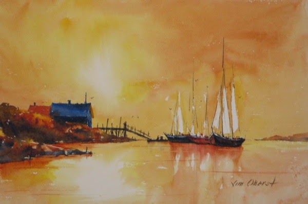
In Sizzling Afternoon, there are no cool colors at all in the sky and water. Warm colors were chosen to best communicate the heat:
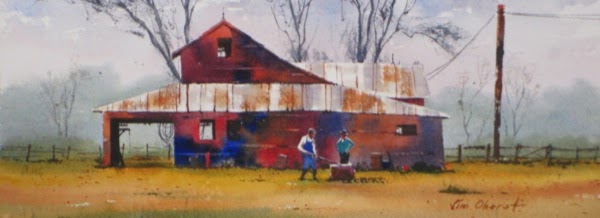
Finally, in See-Through, it's clear that all wood need not be brown:
I hope these examples of color freedom provide some encouragement to artists of realism to try color manipulation and bring more interest and entertainment to their paintings.
Subscribe to my e-newsletter here, and have these artist tips, plus images of my latest paintings, delivered right to your inbox!

